
There are three primary commercial statistics packages in use today. SAS, SPSS, and Minitab. Large universities and commercial firms use primarily SAS or SPSS and most of the datasets available on the Internet are available in one of those two formats. Unfortunately, they are also very expensive. Minitab is used extensively in education and some in business. While still expensive, it is not as expensive as the other two. We used to use SPSS here at Richland, but they have drastically changed their pricing structure in the last few years and we can no longer justify the cost. We will be using Minitab in this course.
Minitab is commercial software, it is not free. You can not borrow a CD from the instructor and take it home to load on your machine.
However, Minitab allows a free 30 day trial of their software and you can also purchase a 5 month (1 semester), 12 month (1 year), or perpetual (forever) license that you can install on your home machine for $25.99, $49.99, or $99.99 respectively. To get the software for home, you will need an Internet connection. Go to http://www.minitab.com/ and click on the "Download the MINITAB 13 Demo" link on the left side. Complete the information on the form and then it will take you to a site where you can download the 30 day demo or purchase and download the full version.
You are not required to purchase Minitab for this course. If you wish to use it at home, then you may pursue one of the options above. It is available for use at Richland in either the classroom S137 or the open computer lab C239. There may be, as need arises, other locations where the software will be installed.
To start Minitab, navigate through Start / Programs / MINITAB 13 for Windows / MINITAB. There may also be a desktop icon that you can click on to open Minitab.
There are two major file types in Minitab: Projects and Worksheets.
A worksheet looks like a spreadsheet and contains data. Worksheets can be accessed by hitting Ctrl-D (for Data) or by selecting them from the Window menu. There can be more than one worksheet open at a time and you need to make sure that you have the proper one selected before choosing any other commands since that controls which variables you can choose from.
A project includes all the information from the current project. It includes worksheets, graphs, text output, comments, etc. There can only be one project open at a time. When you open a worksheet into a project, any changes to that worksheet are limited to that project, in other words, the original file is unchanged.
The main session window is where your output is generated and can be accessed by pressing Ctrl-M or selecting it from the Window menu. The output in this window can be edited to delete information you don't want or to add information that needs added. Later on, there are instructions on using the ReportPad, but if your report has simple demands (no graphs mixed with text or no fancy fonts), then the session window is the quickest way to annotate your output.
This is the initial screen that appears when you open Minitab.

Minitab includes a StatGuide to help you work through and understand the statistics. It also includes a tutorial. It is highly recommended that you work through at least the first tutorial on the basics of the program. The StatGuide and tutorials can be found under the Help menu.
There will be two main locations for the data for our class. The data that comes with Minitab will be located under the \\acad1\minitab\mtbwin\ directory. The data for our class will be located under the \\acad1\stats\01\ directory. Minitab remembers the last place that data was opened from, so you will periodically need to navigate from one location to the other.
If you are not familiar with the Windows system, this can be intimidating. Feel free to ask people around you for help. The instructor can also help, but it is often quicker to get help from someone else as there is only one instructor and lots of students.
When you give the output the to instructor, it should be organized neatly and include the name of the group and the names of the group members at the top.
The facility within Minitab for creating reports is called the ReportPad and can be accessed choosing the Project Manager (Ctrl-I) or by using the icon bar on the upper right of the screen and choosing ReportPad. The ReportPad is the third icon from the right and looks like a little notepad with an A in the lower right.

Whenever you create output that you want to include in the final report, click the right mouse button and choose "Append Section to Report". If you create a graph that you want to include in the report, then click the right mouse button on the graph and choose "Append Graph to Report".
The ReportPad has some editing features available and you can entirely create your output in the ReportPad.
You can also highlight text from a session and use the copy and paste commands to paste it into a word processor (Word / WordPerfect). You can copy your graphs by clicking the right mouse button and choosing "Copy Graph". You can then paste the graph into your favorite word processor. You should use these features when creating your semester project.
We are going to collect data about trees. Use the trees in your yard, a neighbor's yard, or a park if you don't have any in your yard. Each student needs to find at least three (3) trees and collect at least four (4) leaves from each tree. Try to find deciduous trees (avoid evergreens) that have only a single trunk, it will make things easier. If you have young children, this would be a good activity to involve them with.
This information will be in one worksheet, which we will call tree. Each variable will become a column in Minitab, and we label the columns with the names of the variables. Note, the variable names can be up to 31 characters, but many outputs only include the first eight letters of the variable name, so try to keep the names short wherever possible.
Collect the following information.
type Type of tree. Place this in C1. If your not sure what type of tree you have, you can visit http://www.fw.vt.edu/dendro/forsite/key/intro.htm and get an idea. The site asks you some questions about the type of tree that you have and then shows you leaves and names so that you can identify your tree type. The site is for trees in Virginia, but it should be useful for most of the popular trees around here.
circum The circumference of the tree in inches. Place this in C2. The standard is to measure the circumference at breast height (CBH). Since breast height differs for different individuals, the standard is defined to be 1.35 m above the ground. 1.35 m is about 53 inches (4' 5"). We will measure the circumference by taking a string or cord and wrapping it around the tree and then measuring the length of the string.
diameter Diameter of the tree in inches. Go ahead and label C3 as ‘diameter', but don't measure the diameters because they can be calculated from the circumferences by dividing by π. So don't enter information in this column until all the other data has been collected.
Once the data has been collected, we can calculate the diameters. This can be done at any time once you have circumference data, so if you collect more data, you can repeat this command and it will re-calculate the circumferences.
Go to Calc / Calculator and store the results into diameter. The expression is circum / pi(). Hit the OK key to perform the calculations.
The screen should look like this before hitting OK.

The second worksheet that we will create will be called leaf and will contain information about the leaves.
For each tree, collect at least four leaves. Try to get leaves from different parts of the tree if possible. The measurements we're taking can be made while the leaf is still on the tree, so there is no need to pull them off the tree unless you just want to. For each leaf that you collect, we will measure the following.
type Type of tree. Place this into C1. This is the same as the tree data that we collected.
circum Circumference of tree in inches. Place this into C2. This is the same as the tree data that we collected.
stem Length of stem in centimeters. Place this into C3.
width Breadth (width) of the leaf in centimeters at its widest spot. Place this into C4.
length Height (length) of the leaf from the end of the stem to the tip of the leaf. Place this into C5.
You might be wondering why we just don't have the one worksheet with all the information in it. We are going to describe the circumference and diameter of the tree a little bit later on and if we used just one data file, each tree would be in there at least four times (once for each leaf). That would weigh some trees more heavily (if someone collected six leaves instead of four) than others and it would also reduce the variation. Since we don't want to do that, we create two separate worksheets.
The class will be divided into groups of approximately 4 students each depending on the number of people in the class. Each group will enter their data into worksheets and then the instructor will merge the worksheets together to get the final dataset that the class will use.
Each group will pick a name for their group. The name of the group will be the name of a tree (oak, pine, maple, sycamore, redwood, poplar, dogwood, etc.) and conflicts will be resolved using random selection. A directory on the server will be created for each tree group and all of your files should be stored in that directory to prevent filename conflicts.
For the data for your group only, find the following.
1. Give the basic descriptive statistics for the both the circumference and diameter of the trees by the type of tree. Comment on which trees appear to have the largest diameters and which have the smallest diameters (rank the type of trees).
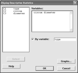
2. Give the basic descriptive statistics for the length of the stems of the leaves. Include a histogram with normal curve and a boxplot (click on Graphs from the Display Descriptive Statistics screen). Comment on whether or not it appears the data is normally distributed by looking at the histogram with the normal curve.
3. Under Basic Statistics, perform a normality test on the length of the leaves using the Anderson-Darling method. The data is approximately normal if the data in the normal probability plot (q-q plot) falls close to the line or the p-value is greater than 0.05. The data is not normal if the points do not fall close to the line or there are systematic patterns of above or below the line or if the p-value is less than 0.05. Comment on whether or not the leaf lengths appear normally distributed.
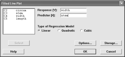
4. Go into Regression and generate a Fitted Line Plot with the response variable width and the predictor variable stem. Comment on whether or not it appears the stem length is a good predictor of the width of the leaf based on how well the line fits the data.
As an individual, evaluate each member of your group including yourself. Comment on how much they contributed to the group. Did they show up for all the meetings, did they participate when they showed up, did they pull their weight or did they not do anything? Write a short paragraph for each person, including yourself.
In addition to a paragraph describing each person, assign them a score between 0 and 5 points for their effort in the group. Remember you are evaluating yourself, also.
The score that you receive for this part of the project will be the mean scores given to you by each person in your group. All evaluations should be on a single sheet of paper that should be typed. This is an individual assignment, not a group project.
There is information available online at http://www.bestplaces.net/ about metropolitan areas in the United States. We are going to collect the data for the 46 cities listed for Illinois and then compare and analyze them.
For this project, you will be able to pick your own groups of between two and four students each. Every person must belong to a group with at least one other person.
When you submit the reports, submit one for the entire group with the names of the group members at the top.
Each student will be given two cities to collect the information for. This works well as the site has a "Compare Two Cities" feature that gives all the information we're going to collect. The data collection is designed to be done individually, although groups may re-assign tasks as they will.
Open the Minitab worksheet file \\acad1\stats\01\cities\ilcities to enter your data. The names of the cities and the names of the variables are already entered into the file. When you save your file, save the worksheet with a different name so that you don't overwrite any changes that someone else is making. The instructor will merge the data together into one file.
Although we won't be analyzing this data until the second half of the course, you can collect your data and enter it at any time. It might be a good idea to collect it early so that you will have it done and not feel the time constraints later on. Also, this gives you time to get the data in case the website is down later on.
Answer the following questions based on the complete Illinois city data (not just your two cities).
1. The Cost of Living Index (COLI) is centered about 100. As an explanation, the COLI for Decatur is 91.4. That means it is 8.6% cheaper to live in Decatur than the average US city. The COLI in Aurora is 109.3, that means it is 9.3% more expensive to live in Aurora than the average US city.
Use a one-sample t test to test the claim that the mean Cost of Living for Illinois is 100, the same as the national average. Test the claim for all of the Cost of Living indices, the overall, housing, food, transportation, utilities, health, and miscellaneous. You can do this with Minitab by including more than one variable in the list.

Give a conclusion for each of the tests.
2. Test the claim that the there is a higher percentage of Hispanics living in cities with high population densities (at least 4000 people per square mile) than in cities with low population densities (less than 4000 people per square mile).
While it may seem that this is a test about proportions (because we're using the keyword of percentage), we're actually going to fudge and compare two independent means. Comparing proportions requires frequencies and we have percentages. We could find those frequencies by multiplying by the population, but with samples that large, even the smallest difference would be significant. The other problem is that when we compare proportions, we can only have two samples, and we have 46 that we want to compare. Thus, we'll compare the mean percentages.
The next problem that arises is that we have no variable defining "high" or "low" population densities. I've arbitrarily chosen 4000 people per square mile as the dividing line between high and low population density, but we need to tell Minitab to use those values.
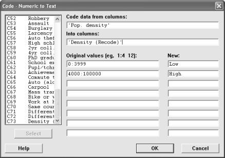
In the data window, go to the far right of the data and label a new column as "Density (Recode)". There's nothing special about adding the word "(recode)" to the name, it just lets us know that it's not the original data. Now we need to tell how to recode the variables. Go to the Manip menu, choose Code, and then Numeric to Text. Recode the population densities between 0 and 3999 as "low" and those above 4000 as "high". To do this, you specify ranges of numbers with a colon between them. There is no easy way to say "4000 and above", so we stick in an artificially high number, higher than any of the values, say 100,000. The original values should look like 0:3999 and 4000:100000
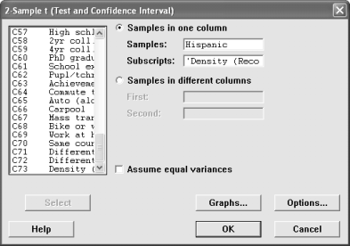
Choose a two-sample t test with the percent of Hispanic population as the sample variable and the Density (recode) as the subscript variable. Include a boxplot of the means.
Since our claim was that the percent of Hispanics is higher for high density cities than it is for low density cities, our tail is a one tail test. Go into Options where you can choose the type of alternative hypothesis you have. When you choose the type of alternative hypothesis, Minitab arranges the subscripts in alphabetical (or numerical) order, so you are comparing "high" to "low". If you had labeled your subscripts as "sparse" and "dense", then it would compare "dense" to "sparse". Make sure your alternative hypothesis agrees with that order. Finally return to the main test screen and say OK.
Give a conclusion and add any personal commentary.
3. Is there a difference between the cost of living for housing and the cost of living for food?
Since these are two variables instead of one variable (categorized by a second variable), we're going to use the pair-samples t-test to test this claim.
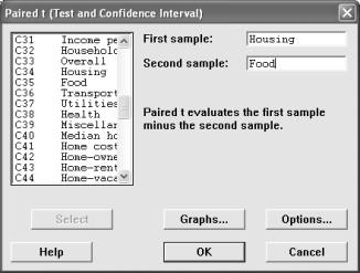
Give a conclusion and any other narrative material you feel appropriate.
4. Is there a linear relationship between the amount of spending per student and the student achievement? If so, describe the relationship.
Go into the Stat menu and choose Correlation to determine whether or not there is a linear relationship between the variables.
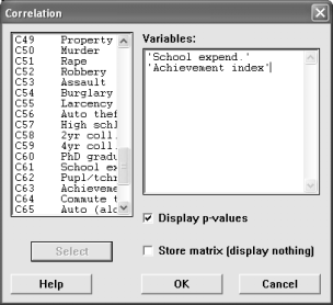
If there is significant linear correlation, then use the regression command to describe it (give the regression equation). The regression command is under the Regression menu. Give a normal probability plot of the residuals with the graph.

Comment on the correlation and regression. Does the data indicate what you thought the relationship would be? One of the requirements is that the residuals be normally distributed, do they appear to be?
5. What variables contribute towards the median housing cost for a city?
Go into the Regression menu and choose Regression. Use the median home cost as the response variable. For the predictor variables, choose median age, household size, percent of whites, percent of executives, percent with 4 year college degrees, and the amount of school expenditures per student.
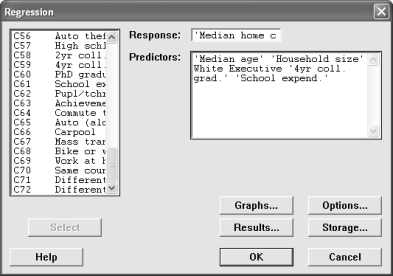
Remove the sequential sum of squares and the unusual observations from the output.
Which of the independent variables contributes the most to the median home cost? Does this sound reasonable and why?
Go to the Stats menu and choose Correlation. Find the correlations between the variable that is most significant in the model and the two that are the least significant. Are there high correlations? If there are, the two variables might not be significant because much of their influence is explained by the one variable that is highly significant.
Go through the regression again, but this time remove the two variables that are least significant from the model. Remove the sequential sum of squares and the unusual observations from the output. Did the R2 increase or decrease? What about the adjusted R2?
Repeat the regression once more, this time removing the one variable that is least significant from the model. Before clicking OK, go into Storage and check Fits; this will save the predicted values into the worksheet as a new variable called FITS1. Remove the sequential sum of squares and the unusual observations from the output. Did the R2 increase or decrease? What about the adjusted R2? Are there any variables still in the model that don't significantly contribute to the model?
Write the final model down. What was the predicted median home cost for Decatur? How far off was it and in what direction?
6. Are the median age of the people the same for cities with different population growth rates?
Recode the "population change" into four groups. Negative growth, 0 - 4.9%, 5.0-9.9%, and 10.0%+. Follow the instructions under question 2 and call the variable "Pop. Change (recode)". Label the groups as A, B, C, and D. The groups are ordinal and if you choose labels like "negative, small, medium, large", then when you generate plots, they will be placed into alphabetical order and not in the original order. Alternatively, you could use the numeric to numeric coding and recode them as 1, 2, 3, and 4.
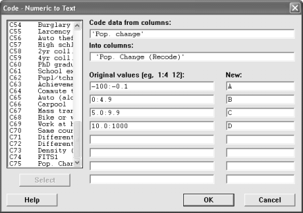
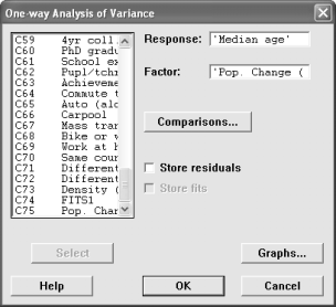
Now, go to the Stat menu and choose ANOVA and then One-Way. The Response variable is the median age and the factor is is the recoded population change. Generate a boxplot of the data.
Interpret the Analysis of Variance. Give a conclusion to the question about the equality of the means. If the means are not all the same, then look at the confidence interval chart and say which groups appear to have different means.
Look at the boxplots. The red dot is the mean of the group; do you notice a pattern about the median age as the population change increases?
As an individual, evaluate each member of your group including yourself. Comment on how much they contributed to the group. Did they show up for all the meetings, did they participate when they showed up, did they pull their weight or did they not do anything? Write a short paragraph for each person, including yourself.
In addition to a paragraph describing each person, assign them a score between 0 and 5 points for their effort in the group. Remember you are evaluating yourself, also.
The score that you receive for this part of the project will be the mean scores given to you by each person in your group. All evaluations should be on a single sheet of paper that should be typed. This is an individual assignment, not a group project.
Date |
Description |
Sep 6 |
Tree data collected and entered |
Sep 20 |
Tree descriptive statistics due |
Sep 24 |
Tree group evaluations |
Oct 18 |
City data collected and entered |
Dec 2 |
City inferential statistics due |
Dec 5 |
City group evaluations |