Minitab Notes for Activity 1
Creating the Worksheet
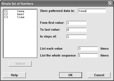 There is a little bit of setup that you need to do before entering the data.
Minitab can also help by creating some of the values for you.
- Label the columns as team, heat, and time.
- Have Minitab automatically enter the team data for you.
- Choose Calc / Make Patterned Data / Simple Set of Numbers
- For the team column, the values go from 1 to the number of teams
(shown as 8 in the figure) and each value should be repeated 3 times
since
there are 3 heats for each team.
- Click OK
- Have Minitab automatically enter the heat data for you.
- Choose Calc / Make Patterned Data / Simple Set of Numbers
- For the heat column, the values go from 1 to 3 since there are
3 heats for each team. Each value is listed only once,
but the whole
sequence
is repeated
for each team (8 in our example).
- Click OK
- Enter the time data yourself
- Save the Project
- Choose File / Save Project As
- Change to the R: drive and into the proper folder for your section
(01, 02, or 03).
- Change into the act1 folder
- Type a file name that is unique to your
group.
- Click Save
Summarizing the Data (Question 4)
Once you have your data entered into Minitab, you may work with it. One
of the most common things we will do is display the descriptive statistics.
This screen will give you the following statistics.
- N = Sample Size
- Mean = Mean
- Median = Median
- TrMean = Trimmed Mean
- StDev = Standard Deviation
- SE Mean = Standard Error of the Mean
- Minimum = Minimum
- Maximum = Maximum value
- Q1 = 1st Quartile
- Q3 = 3rd Quartile
You may describe more than one variable at a time. However, in this problem,
we only have one variable, time, that we want to
describe. The other two variables are categorical variables used for classification
purposes only, it would make
no sense to describe them. Sample output from the
descriptive
statistics command is shown in the figure.
Using All of the Data
This is the way to describe the time for all of the teams and all of the
heats.
- Go to Stat / Basic Statistics / Display Descriptive Statistics
- Select the time column for the variables section
- Click OK
You should get some output that looks like this.
Descriptive Statistics: time

Variable             N       Mean     Median     TrMean      StDev    SE Mean
time                24      20.75      19.99      20.60       5.32       1.09

Variable       Minimum    Maximum         Q1         Q3
time             10.76      33.96      17.79      23.90
Grouping the Data by Another Variable
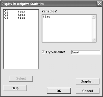 This is the way to describe the time for each of the heats. We use the "By
Variable" option to do this. The column used for the By Variable should
be a categorical variable such as the gender, race, age group (but not age
as a number), or heat number. There should be few categories for this variable,
do not use variables that have large numbers of unique values for the By Variable.
Do not use measurement variables (height, weight, age, time) as the by variable.
- Go to Stat / Basic Statistics / Display Descriptive Statistics
- Select the time column for the variables section
- Check the By Variable box
- Tell Minitab to describe the data by the variable heat.
- (Optional) Click on Graphs and turn on the Graphical Summary.
- Click OK
Box Plots (Question 5e)
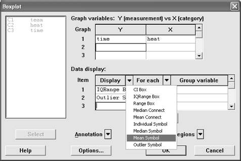 A box plot is a way to graphically explore the data. Choose the variable
you want to describe as the y variable and the way you want to group the data
by the classification variable x. The box plot does not normally have the
mean on it, but we will add it here for reference purposes.
- Go to Graph / Boxplot
- Select time as the Y variable and heat as the X variable.
- Look at the "Data Display" box. Right now, Item 1 is the IQRange
Box and Item 2 is the Outlier Symbol. We are going to add Item 3, the Mean
Symbol.
- Click the empty cell for Item 3 in the Display column.
- Click on the pull down menu for the Display column (the down arrow
next to the word Display) and choose Mean Symbol.
- Click in the empty cell for Item 3 in the For Each column.
- Click on the pull down menu for the For Each column and choose
Graph.
- Click OK
- Copy the graph into Word so that
you can comment on it and print it. To do this, click the right mouse
button on the graph
and choose
Copy Graph, switch
to Word,
and then Paste
it
into
your document.
- After appending the graph to the report, you may
close the graph window.
Histograms (Question 6)
 A histogram is a good way to look the data and see where it lies. We can
also use it to let Minitab count the number in each group for us, rather than
us having to do it manually.
Normally, we would let Minitab just automatically assign groups for us, but
in this case, we're specifically looking for bars that are one standard
deviation wide. That means that we're going to have to do some extra
work that we wouldn't normally have to do.
For this example, let's assume that the mean is 20.75 and the standard
deviation is 5.32. Find the mean minus three times the standard deviation and
the mean plus three times the standard deviation: 20.75 - 3(5.32) = 4.79
and 20.75 + 3(5.32) = 36.71. These numbers correspond to our
lowest
and
highest
class
boundaries
and will be used later.
- Go to Graph / Histogram
- Select time as the X variable
- (Optional: Recommended) Change the formatting on the bars of the histogram.
By default, the bars are not shaded, so it can be difficult to see them.
You can change that by following these steps.
- Highlight the "Bar" from Item 1
- Click Edit Attributes
- Click on the pull down menu for Fill Type and choose Right Slant
(or some other type of fill)
- You can also change colors of the bars if you like
- Click OK
- Click Options
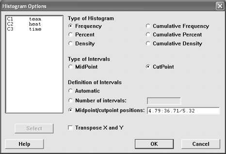
- Change the type of Intervals to CutPoint instead of MidPoint
- Change the Definition of Intervals to Midpoint/cutpoint positions
- Enter the lowest and highest boundaries found earlier to specify
the intervals. This is specified using the format "lowest:highest/width".
That is, a colon between the lowest and highest cutpoints and a
forward slash
between the highest boundary and the width of each bar. Our data
would look like 4.79:36.71/5.32,
but you need to use your own data.
- Click OK
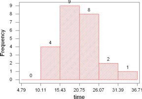 (Optional: Recommended) Have Minitab label the graph with the
counts for each bar. By default, Minitab only shows the bar and you
have to
figure out
how many are in the group by looking at the graph. You can have Minitab
label the frequencies for you by following these steps.
- Click on the pull down menu for the Annotation and choose Data
Labels
- Check Show Data Labels
- Click OK
- (Optional) You can add titles to your graph by choosing the Title
option from the Annotation pull down menu.
- Click OK to generate the graph.
- Click the right mouse button on the graph and Copy the Graph. Then switch
to Word and paste it.
- (Optional: Recommended) Close the graph.
Normal Probability Plots (Question
7)
A probability plot can be used to check to see whether the population your
sample came from has a certain distribution. In this case, we're
going to be checking to see whether or not the data came from
a normally distributed
population. You will need to read the section in chapter 6 on
how to tell if data is normal or not to figure out how to interpret
the
graph,
but
we
will
show you
how to
generate the
graph here.
- Go to Graph / Probability Plot
- Select the variable time
- (Optional) Turn off the table of percentile estimates. We're not
going to use it and it takes some space. But on the other hand, we're
not going to print it, either, so it doesn't really matter for this
problem.
- Click on Options
- Uncheck Display table of percentile estimates
- Click OK
- (Optional) Change the distribution. By default, the Normal
distribution is used. This is what we want here,
but you could change the distribution
to some other distribution (this might come in
handy later).
- Click OK
- Click the right mouse button and copy the graph, switch to Word, then
paste the graph.
- (Optional: Recommended) Close the graph
Checking Equality of the Means or Medians (Question 8)
There are two possible tests that we're going to use here. One is the
One-Way ANOVA and the other is the Kruskal-Wallis. You don't need to
know exactly what these are right now, just how to find them on the computer
and then the instructions for interpreting are on the activity sheet.
One-Way ANOVA
The One-Way ANOVA tests means and should be used when the data comes from
a normally distributed population.
- Go to Stat / ANOVA / One-Way
- Select time as the response variable
- Select heat as the factor variable
- Click OK
- The p-value is at the end of the heat row of the ANOVA table
Kruskal-Wallis
The Kruskal-Wallis test is used to test equality of Medians and should be
used when the data does not come from a normally distributed population.
- Go to Stat / Nonparametrics / Kruskal-Wallis
- Select time as the response variable
- Select heat as the factor variable
- Click OK
- The p-value is at the end of the output
Annotating and Printing Your Output
Once you have generated all three graphs and copied them into Word, it's
time to add your name to the report and print it out. You did add comments
as you went, right? If not, be sure you do that before you print it out.
Save Your Work
Be sure to save your work! This allows you to go through and work on the activity
incrementally (you can do part of it one day and finish it another day).
All open windows are saved when you save the project, but if you close a
graph, it won't be saved. All information appended to the report is
saved and so you can close the graph windows after appending.
Save your Word document, too. Put it in the same directory with the same name.
It will have a different extension, so you won't overwrite your minitab file.
 There is a little bit of setup that you need to do before entering the data.
Minitab can also help by creating some of the values for you.
 This is the way to describe the time for each of the heats. We use the "By
Variable" option to do this. The column used for the By Variable should
be a categorical variable such as the gender, race, age group (but not age
as a number), or heat number. There should be few categories for this variable,
do not use variables that have large numbers of unique values for the By Variable.
Do not use measurement variables (height, weight, age, time) as the by variable.
 A box plot is a way to graphically explore the data. Choose the variable
you want to describe as the y variable and the way you want to group the data
by the classification variable x. The box plot does not normally have the
mean on it, but we will add it here for reference purposes.
 A histogram is a good way to look the data and see where it lies. We can
also use it to let Minitab count the number in each group for us, rather than
us having to do it manually.
 (Optional: Recommended) Have Minitab label the graph with the
counts for each bar. By default, Minitab only shows the bar and you
have to
figure out
how many are in the group by looking at the graph. You can have Minitab
label the frequencies for you by following these steps.