Technology Exercise 1: Exploring and Understanding Data
Collecting the data
Go to the Box Office reviews at Yahoo
Movies at http://movies.yahoo.com/boxoffice/latest/rank.html.
You may want to right click your mouse button on that link and say "Open
in New Window" so
that you can continue to have these instructions available to you. Depending
on the time of the week, you will either get the top 10 movies for the weekend
or the full 100 from the last week. Choose the data that has the full 100
movies available.
Mass collection using copy / paste
- Highlight the information for the top 40 movies by dragging
your mouse from before the "1" for the first movie to after the last % for
the 40th
movie.
- Copy the information in one of the following ways: 1) pressing Control-C,
2) right clicking the mouse and choosing Copy, or 3) going to Edit and choosing
Copy
- Open Microsoft Excel
- Click in cell A2 of the spreadsheet. Now paste the data into Excel
according to the instructions below for your browser. These instructions
take place
within
Excel, not within
your
browser.
- If you are using Netscape, go to Edit and choose Paste
Special. Paste the information as text.
- If you are using Internet Explorer, then pasting the data
in one of the following ways: 1) pressing Control-V, 2) right clicking
the
mouse
and choosing
Paste, or 3) going to Edit and choosing Paste.
- It's now time to clean up the data.
Highlight columns E, F, G, and H by clicking on the E at the top of column
E and
dragging across to the H.
- Format the cells by either 1) pressing Control-1, 2) right clicking the
mouse and choosing Format Cells, or 3) going to Format and choosing Format
Cells.
- Click on the Number tab (if it's not already there) and choose General
for the format. Press OK.
- Highlight columns A and B (see instructions in step 5). After highlighting
the columns, delete them by either 1) right clicking the mouse and choosing
Delete or 2) going to Edit and choosing Delete.
- Highlight the column that contains the distributor information (should
be column B after deleting the other two columns) and delete that column.
- If you do not have a blank row at the top of your spreadsheet because you
didn't paste the data into cell A2, then highlight row 1 by clicking
on the
1 on
the
far left
of
the
worksheet. Now choose Insert Row by either 1) right clicking the mouse and
choosing Insert or 2) going to Edit and choosing Insert.
- Use the first row to label the columns with headings "title","weekend",
"total", "weeks", and "theaters". Label the next columns (without any data)
as "critic", "yahoo", "rating", "length", and "tomatoes".
- Save your spreadsheet into the R: drive. Use the R:\xx\tech1 folder
where xx is your section number (01, 02,
or 03). Save it
as a name that is unique for your group. If you are collecting this data
at home, then save it onto a floppy disk to bring into school. If you feel
comfortable making a folder to save your information into, then go ahead
and save all your files in that folder.
Manual collection of information
Okay, now we've got most of the information collected. The rest of it needs
to be manually collected and entered into the spreadsheet.
- For each movie in your list, click on the title of the movie and record
the critic's rating into the "critic" column, the yahoo user's
rating into the "yahoo" column, the MPAA rating (R, PG, PG-13,
G, NR) into the "rating"
column, and the running length in minutes (1 hr, 41 minutes gets recorded
as
101
minutes) into the "length" column. If any information is missing,
then you may be able to find that information at Rotten Tomatoes in the next
step.
- Go to RottenTomatoes.com at
http://www.rottentomatoes.com/movies/box_office.php by
clicking on the link and pull up the same box office list of movies. You
may want to open it in a new window to keep these instructions available
to you. Record the "T-Meter" percents
into the "tomatoes" column
of your spreadsheet.
- Save your spreadsheet with all of the information in it.
Bringing the data into Minitab
We're now ready (finally) to bring the information into Minitab.
- Open the Excel spreadsheet by clicking
on File and then Open Worksheet
- Change the "Files of type" to be Excel
- Navigate through the file system to find the location where you stored
the Excel spreadsheet (for example, R:\01\tech1 or A: if
you saved it on a floppy and brought it in from home).
- Highlight your file and click OK.
- Okay, now comes the fun part. We want to make sure the data is displayed
in the proper order. For the "critic", "yahoo", and "rating" colums, do the
following.
- Right click the mouse button over the column and choose Column and
then Value Order.
- Check the User-specified order box
- In the Define an order window on the right, type the order you want
the values to appear in. You can choose whether you want A+ first or
last and the order you want the ratings in.
- Click OK and then repeat for the other two variables.
- Label another column (should be C11) as "fresh". Rotten Tomatoes gives
each movie a fresh or rotten rating based on the tomato-meter. If less than
60% of the ratings are fresh, then it is considered rotten. We're going to
have Minitab compute whether the movie is fresh or rotten.
- Click on Manip, choose Code, and then Numeric to text.
- Code the data from the "tomatoes" column
- Code the data into the "fresh" column
- The original values from 0 to 59 (entered as "0:59") have a new value
of "rotten" and the original values from 60 to 100 (entered as "60:100")
have a new value of "fresh". No quotes are entered on any of those.
- Click OK
- Save your Minitab file onto the R: in the proper directory (see step 12
above) so that you can open it back up later. Go to File and choose Save
Project As. Use a name that is unique to your group.
- Now that you have it saved, we're going to convert the weekend and total
values into millions of dollars instead of
just dollars.
- Click on Calc and choose Calculator
- Store the result in "weekend"
- The expression should be "weekend / 1000000"
- Click OK
- Repeat steps a-d, except this time, use "total" instead of "weekend"
in parts b and c.
- Check the results and make sure the look right. If not, then close the
file without saving (only if you saved it in part 8, otherwise you'll lose
the whole thing), then reopen the project and fix it.
- Once the results look okay, then save it again.
From now on, whenever you need to work with this data, open up your project
by going to File and choosing Open Project.
Displaying Categorical Data (Question 2)
There are several ways to explore the data. You will need to pick which methods
to use with which variables. Below you will find the Minitab instructions for
several types. There is nothing that says you have to use the same variables
I do, just change the name of the variable where appropriate in the instructions.
Frequency Table
Frequency tables are appropriate for categorical data or quantitative data
with limited numbers of responses. All you can do with the frequency table
is count information where each data point is counted only once. If you
have frequency data then use the contingency table (Cross tabulation).
- Choose Stat / Tables / Tally
- Click in the Variables box and then double click on the variables you want
to tally.
- (Optional) Check the type of tallys you want. The default is counts and
that is usually good enough. You may want percents. Cumulative counts or
percents tell you what part of the sample data is either that category or
below. This only makes sense when you have ordered data.
- Click OK
Bar Chart
 Bar charts are appropriate for categorical data. It allows you to graph a
function (count, mean, st. dev) of a quantitative (measurement) level variable
that is categorized by another variable.
For example, let's say that you want to know how many theaters are showing
each rating of movie.
- Choose Graph / Chart
- Set the type of function
- Click in the first cell (the function column) of graph 1
- Click on the pull down button next to function
- Choose sum (or count, or standard deviation, or ...)
- Set the variable to summarize
- Click in the second cell (the Y column) of graph 1
- Double click on a measurement type variable. In our case, that would
be theaters.
- Choose the categorical variable
- Click in the third cell (the X column) of graph 1
- Double click on a categorical type variable. For our example, we would
use rating.
- (Optional - Recommended) Change the appearance of the bars by clicking
on Edit Attributes. By default, the bars are not shaded and it can be a little
difficult to see them. I like to go through and set the foreground color
to red and the fill to right slants. It's not that you can print in color,
but it at least looks pretty on the screen.
- (Optional - Recommended) Choose Annotation / Title and add a title to the
graph that describes what we're looking at.
- (Optional - Recommended) Choose Annotation / Data Labels. Once there, check
the Show Data Labels box
- Click OK
After the graph is generated, you can double click on it and make edits. For
example, if you don't want the vertical label to read "sum of theaters", double
click on the label and type what you want it to say.
If you don't like the scaling that is used for the graphs, you can use the
Frame button. The Min and Max option will allow you to specify the lower and
upper boundaries for the graph. The Tick option allows you to change the
number of tick marks and labels there are for either axis. The major ticks
are where the values appear and the minor ticks are the number of little tick
marks (but no numbers shown) between the major ticks (the sample graph shown
has 4 major ticks and 4 minor ticks for the Y axis). The Grids option allows
you to draw horizontal or vertical grid lines behind the
bars.
Pie Charts
Pie charts are useful when you want to summarize a categorical variable graphically.
You may either have just one variable or another variable that specifies frequencies
(like the number of theaters).
- Choose Graph / Pie Chart
- If you have frequency data, then check the Chart Table box and enter the
categories and variables. Otherwise, just click in the Chart Data In box
and then double click on the categorical variable you wish to graph.
- (Optional) If you have several categories that have very small percentages,
then enter a value into the "Combine categories less than ___ % into one
group" line. If you entered 2 here, then any category with less than 2% of
the values would be lumped into a group called "Others"
- (Optional) You may explode certain slices by entering the slice number.
For instance, a 2 would explode the second slice. You can explode more than
one slice, just put a space between the slice numbers.
- (Optional - Recommended) Enter a title for the graph. Otherwise it will
say "Pie Chart of ____" where the blank is the name of the variable you graphed.
Under the Options menu, you have several other options you can set. You can
choose whether to display the freqency and percent (the default), just the
frequency, just the percent, or nothing. You can connect the slices to the
labels with lines. You can omit the missing data as a category (normally, a
slice will be given to any missing values).
Contingency Tables (Question 3)
A contingency table is appropriate when you have data that you would like
to count and it is categorized in two ways. A contingency table is also known
as a joint frequency distribution. If you only want to categorize that data
in one way, then use a frequency table.
- Choose Stats / Tables / Cross Tabulation
- Click in the classification variables box and then double click on the
categorical variables. The first one you add with be the row variable and
the second one you add will be the column variable.
- (Optional) You can generate a marginal distribution by checking row percents
or column percents.
- Row percents: If you check row percents, then it will give you marginal
percentages so that the total for the row is 100%. In English, that means
that it
will tell you what percent of the row each column is. In
our example, that would tell you what percent of "fresh" movies were
G, PG, PG-13, R, and NR and what percent of "rotten" movies were G,
PG, PG-13, R, and NR.
- Column percents: If you check column percents, then it will give you
the marginal percentages so that the total for each column is 100%. In
English, that means it that it will tell you what percent of the column
each row is. In our example, that would mean what percent of G movies
are fresh and rotten, what percent of PG movies are fresh and rotten,
etc.
- Click OK
You can go into options and choose which categories to use for your classification
variables. For example, if there aren't very many NR movies and you want to
skip them, options is where you would specify that.
The cross tabulation command is actually quite powerful and we've only touched
the surface of it with the contingency table. Here are some other features
of the cross tabulation.
The rest of this section is given to you for purely informational purposes only.
You do not need them for this activity. You may skip
to the next section if
you want.
Frequency distributions with a frequency column
To count values when there are frequencies involved, you can't use the frequency
table. Instead use cross tabulation but only enter one classification variable.
For example, to count the number of theaters showing each rating of movie
(the numbers shown on the bar chart above), do this.
- Choose Stat / Tables / Cross Tabulation
- Click in the classification variables box and then double click rating
- Check the "Frequencies are in ______" box and then click the blank and
put theaters in that spot.
- Click OK.
Summarizing data in table format
The Stat / Descriptive Statistics command will give you the summary statistics
for the variables you choose. You can even split them up by another variable.
However, you get the sample size, mean, median, trimmed mean, standard deviation,
standard error of the mean, minimum, maximum, 1st quartile, and 3rd quartile.
Most summary data only includes sample size, mean, and standard deviation.
If you have frequency data, then your just out of luck with descriptive statistics
because it weights each observation once.
Let's say that I wanted to describe the running time of movies by MPAA rating.
I could do that with Stat / Basic Statistics / Display Descriptive Statistics.
I would describe the length variable by the rating and get something like this.
Variable   rating            N       Mean     Median     TrMean      StDev
length     G                 5       74.4       87.0       74.4       28.7
           PG                6      91.17      88.50      91.17      10.52
           PG-13            17     111.24     110.00     110.87      18.92
           R                11     114.09     108.00     112.78      17.08
           NR                1     107.00     107.00     107.00          *

Variable   rating      SE Mean    Minimum    Maximum         Q1         Q3
length     G              12.8       42.0      101.0       43.5       99.0
           PG             4.29      81.00     111.00      84.00      97.50
           PG-13          4.59      85.00     143.00      94.00     132.00
           R              5.15      94.00     146.00     101.00     131.00
           NR                *     107.00     107.00          *          *
Now, let's look at the cross tabulation command and see what it can do. I
want the same results, but I want to scale them by the number of theaters they're
playing in.
- Choose Stat / Tables / Cross Tabulation
- Enter rating for the classification variable
- Check "Frequencies are in _____" and then put theaters for that variable.
- (Optional) Uncheck the display counts so that nothing is displayed.
- Click on Summaries
- Put length as the associated variable
- Check means, standard deviations, and number of non-missing items.
- Click OK
- Click OK
This time, we get results that look like this. If you had unchecked the display
counts in step 4, then the count column wouldn't be there. In this case, the
count is actually more important to us than the number of values.
                 length   length   length
         Count     Mean    StDev        N

 G        2074    98.35     9.50        5
 PG       6092    88.92     3.82        6
 PG-13   17613   122.01    18.12       17
 R       11638   120.53    18.54       11
 NR         58   107.00     0.00        1
 All     37475   114.84    20.66       40
Displaying Quantitative Data (Question 4)
When the variable you want to display is quantitative (measurement is Minitab's
word for it), then you want to choose a dot plot, stem and leaf plot, or histogram.
Dot Plots
- Choose Graph / Dotplot
- Choose the variable(s) you want dot plots for. You may use more than one
variable, each dot plot will generate in its own window.
- (Optional - Recommended) Enter a title.
- Click OK
If you would like to generate dot plots by a classification variable, then
check the "By variable ____" box and put that variable there. For example,
to generate a box plot of the weekend sales and look at them by whether they
were fresh or rotten movies, you would put weekend in the variables box and
then say by variable fresh. When you use the by variable, the dot plots appear
in the same graph in different rows so that you can compare one to another.
Stem and Leaf Plots
- Choose Graph / Stem-and-Leaf
- Choose the variable(s) you want dot plots for. Multiple variables will
generate multiple graphs.
- (Optional) Specify the increment. The stem increment is normally determined
by Minitab depending on your data. It may be 5, 10, or some other value.
If Minitab generates intervals of width 5 and you want it to count by 10s,
then specify an increment of 10.
- Click OK
Do not use the "By variable _____" option here. It is not a way of classifying
the stem and leafs by another variable (for example males and females or fresh
and rotten). It is a way of specifying how to break up the stems into specific
boundaries instead of having a common increment.
You may optionally trim outliers. For instance, if you have one extreme outlier,
then all of the other data may get lumped into one or two groups. Trimming
the outlier looks at where the bulk of the data is.
Histogram
Histograms are like bar charts except that the vertical axis is always frequency
(or percent) and the horizontal axis are not categories, but are determined
by the values of your variable. They are the bins that your textbook talked.
Let's generate a histogram of the number of theaters that each movie is playing
at.
- Choose Graph / Histogram
- Click in the X column for graph 1 and then double click the variable you
want to graph. For our example, that would be theaters.
- (Optional - Recommended) See the optional steps (5 through 7) for the bar
chart above.
You'll want to add filling, a title, display the labels.
- (Optional - Depends) Sometimes you just don't like the way that Minitab
breaks up the bins for you. You can change this by going into Options.
In activity 1, we did this to specify the starting point, ending point, and
width of each bin.
Here are those steps again.
- Change the Type of Interval to Cutpoint
- Click on "Midpoint/cutpoint positions ______"
- Enter "low:high/width". For example, "10:100/15" would start at 10,
go to 100, and have a width of 15 each (so there would be 6 bars). You
should make sure that the width evenly divides into the range (high -
low). You will often subtract 0.5 on the left and add 0.5 on the right.
For example, if you have values from 2 to 9 and you want 4 bars, then
enter "1.5:9.5/2". The 2 is because (9.5-1.5)/4=2.
- Click OK
Read the explanation about frames, ticks, grids, and max and min under the
bar chart for additional information that applies to histograms.
Applying a Logarithmic Transformation (Question 5)
The logarithmic transformation will take an exponential growth pattern and
linearize it. It is especially useful for wage, salary, or income figures.
You have two logarithm functions you can use: LOGT is the base 10 logarithm
and LOGE is the base e logarithm. The base 10 logarithm basically returns the
number of digits before the decimal place (and a little extra) and is probably
appropriate for monetary values. The base e logarithm is more appropriate for
naturally occurring phenomenon like from science.
For the purposes of this example, let's use the weekend gross as the variable
we want to transform. You're free to pick any positively skewed distribution.
- Label an empty column in the data file. I'll call it "log_weekend" since
I'm taking the log of the weekend variable.
- Choose Calc / Calculator
- Store the result in log_weekend
- You have two choices for log. We'll use the base 10 logarithm here. Scroll
down the list of functions until you find "Log 10" and double click. Then
double click on the weekend variable. Alternatively, you could type "logt("
double click weekend, and then type ")"
- Click OK
- Display the graph using one of the methods from question 4.
Dot Plots
Here are two dot plots showing the difference in the weekend sales before
and after applying the logarithmic transform.
Original data. Notice it is skewed to the right.

After the transform. Notice the data is more spread out.

Box Plots (Question 6)
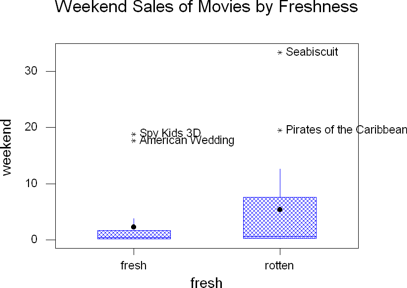 For this example, I'll display the weekend sales by the fresh / rotten rating.
- Choose Graph / Boxplot
- For the Y variable, choose the variable you want to describe. I would use
weekend for this example.
- For the X variable, choose the way you want to categorize it. I would use
fresh for this example.
- (Optional) Add a point for the mean.
For Data Display Item #3, do the following ...
- Click in the first column and then pull down
the menu for Display. Choose Mean Symbol.
- Click in the second column and then pull down the menu for "For each"
and choose Graph.
- (Optional) Shade the box so it shows up better.
- Click on the "IQRange Box"
cell for Data Display Item #1.
- Click Edit Attributes. Fill in the shading and foreground color like
you did for boxplots.
- Click OK
- (Optional - Recommended) Click Annotation and add a Title
- (Optional) Display which points are outliers. In this case, I could label
the outlier points with the title of the movie so I could see which movies
were outliers.
- Choose Annotation / Outlier Labels
- Check the Show Outlier Labels box
- Tell it to "Use labels from ____" and put the title variable in the
blank. If you leave this step off, it will put the numerical value of
the outlier, which may be okay depending on what you want.
- Click OK
- Click OK
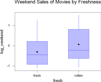 Take
a look at how the box plot looks when you apply it to the transformed data.
This again shows us that the transformed data is much more useful for working
with since it is more symmetric and there aren't the outliers.
The important thing to remember about that, though, is that you're working
with the logarithm of the weekend sales (after dividing by 1,000,000 earlier).
A more useful logarithm transform would be to add 6 to the values, that tells
you the logarithm of the original data. So, when you see a 1 on the graph,
that's really a 7 for the original data, which means that movie brought in
7 digits during that weekend. A seven digit number would be somewhere between
10 million and 100 million. Not bad for a weekend.
The dot in the center of the box plot is the mean.
Numerical descriptions (Question 7)
You will use this a lot in this course. Minitab knows that and so it is the
first choice under the stats menu. It gives you the sample size, mean, median,
trimmed mean, standard deviation, standard error of the mean, minimum, maximum,
first quartile, and third quartile.
- Choose Stat / Basic Statistics / Display Descriptive Statistics
- You may describe several variables. Each variable will get its own row
in the output.
- (Optional) You may describe the data by another variable. This is useful
if you want to compare fresh movies to rotten movies or compare them by the
MPAA rating. You would specify "By variable ____" and then put the classification
variable in that spot. See the section under contingency tables on summarizing
the data in table format for more information and sample output.
- Click OK
Normal Probability Plots (Question 8)
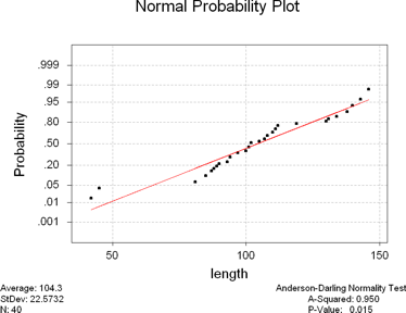 There are two places to generate a normal probability plot. You can either
go to Graph / Probability Plots or to Stat / Basic Statistics / Normality Test.
The first makes prettier graphs, but the second supplies some other information
that may be useful. I'll leave you to your own devices to figure out the probability
plot from the graph menu and tell you how to do it from the stat menu.
In my example, I'll test the length of the movie for normality.
- Choose Stat / Basic Statistics / Normality Test
- Double click on the name of the variable you want to test for normality.
- (Optional) Add a title. The default title is pretty good.
- Click OK
The explanation for interpreting the normal probability plot is given in your
book.
Some of the more observant students will notice that the standard deviation
here does not agree with the standard deviation from the descriptive statistics.
The rest of you will be asking, "How long does this activity go on for?" The
standard deviation here assumes that your data is the entire population, whereas
the standard deviation from the descriptive statistics assumes that the data
is from a sample. The formulas are slightly different, but they are both a
measure of spread.
I want to explain the Anderson-Darling Normality Test values in the lower
right hand corner. The p-value is the probability of getting the results
we did if the data is normally distributed. If the p-value is small (say less
than 5% or 0.05), then there is a very small chance that we would get these
results if there data were normal. Since our p-value here is 0.015, which is
less than 5%, we would say that our data is unusual for a normally distributed
population. Since our results are unusual, we'll reject the assumption
that our data is normally distributed. This should agree with the books explanation
about the data falling along the line, but gives a slightly more definite approach
(an actual number instead of just "close").
Box-Cox Transformation (Question 8)
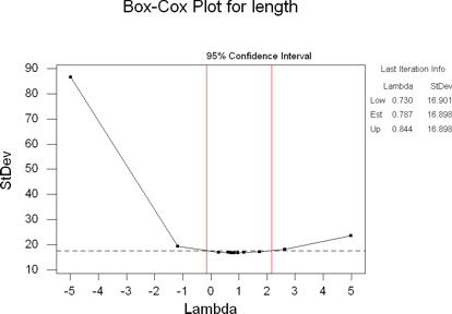 The Box-Cox Transformation is a way to normalize the data by raising it to
a power. The procedure goes through and tries a bunch of different exponents
on your variable until it finds the closest to being normal that can. The value
that it ends up with is called lambda and if it is close to 1, then you really
won't benefit from a transformation. If it was 2, then you should square all
your values and they would be more normal. If it was 0.5, then you would take
the square root of all the values. A lambda of -1 would mean take the reciprocal.
The special value of 0 means take the natural logarithm.
All that really isn't important for you. Just know that there is a way to
transform your data and here's how to do it.
- Label another empty column of your spreadsheet. I'm going to transform
the movie length, so I'll call it box_length.
- Choose Stat / Control Charts
/ Box-Cox Transformation
- The data are in a single column, specify the variable you want to transform
here.
- The subgroup size is 1.
- (Optional - Recommended) Store the transformed data into the new variable
you just created. In my example, that would be box_length. You won't be able
to display the normal probability plot if you don't store the results. You
will be able to find the lambda without storing it, so that's why this is
marked as optional.
- Click OK
For my data, it came up with a estimated lambda of 0.787 with a range of values
between 0.730 and 0.844. However, if you look at the graph, you'll see that
1 is in the interval between the red lines. That means that transforming the
data may not help the normality. You do not need to copy the Box-Cox transformation
output graph to your project.
In this particular transformation, the normality of the data wasn't helped
(it was slightly worse). There are two outliers at the low end that are
affecting things.
Sometimes it helps, sometimes it doesn't. That brings up an important point.
Don't just blindly do something. Remember the mantra, "Think, Show, Tell".
Be sure you think about things.
Standardizing Values (Question 9)
Standardizing variables means to subtract the mean and then divide by the
standard deviation. This is the z-score that was mentioned in chapter 6. Luckily
for us, there is a standardize command built into Minitab.
- Label an empty column with a variable name for each of the variables you're
going to standardize. For example, if I was going to standardize the length
of movies, I would label a column as "z_length". If I wanted to standardize
the number of theaters, I would use "z_theaters".
- Choose Calc / Standardize
- Double click on all of the variables that you want to standardize. In my
case, that would be length.
- Then click in the "Store results in" box and double click on where you
want the standardized results stored. In my case that would be z_length.
If you standardize more than one variable at a time, it is extremely important
that you use the same order in both boxes.
- Click OK.
Now that you've standardized the length, go find the descriptive statistics
for the z_length variable. See the instructions for question 7 on numerical
descriptions if you don't remember how.
 Bar charts are appropriate for categorical data. It allows you to graph a
function (count, mean, st. dev) of a quantitative (measurement) level variable
that is categorized by another variable.
 Bar charts are appropriate for categorical data. It allows you to graph a
function (count, mean, st. dev) of a quantitative (measurement) level variable
that is categorized by another variable.

 For this example, I'll display the weekend sales by the fresh / rotten rating.
 Take
a look at how the box plot looks when you apply it to the transformed data.
This again shows us that the transformed data is much more useful for working
with since it is more symmetric and there aren't the outliers.
 There are two places to generate a normal probability plot. You can either
go to Graph / Probability Plots or to Stat / Basic Statistics / Normality Test.
The first makes prettier graphs, but the second supplies some other information
that may be useful. I'll leave you to your own devices to figure out the probability
plot from the graph menu and tell you how to do it from the stat menu.
 The Box-Cox Transformation is a way to normalize the data by raising it to
a power. The procedure goes through and tries a bunch of different exponents
on your variable until it finds the closest to being normal that can. The value
that it ends up with is called lambda and if it is close to 1, then you really
won't benefit from a transformation. If it was 2, then you should square all
your values and they would be more normal. If it was 0.5, then you would take
the square root of all the values. A lambda of -1 would mean take the reciprocal.
The special value of 0 means take the natural logarithm.