Technology Exercise 2: Exploring Relationships Between Variables
Collecting the data
Go to the Box Office reviews at Yahoo
Movies at http://movies.yahoo.com/boxoffice/latest/rank.html.
You might want to right click and choose "Open in new window" so that you
will still have these instructions available to you.
We
are going
to gather information on the opening weekend movies, so make sure you don't
collect your information during a weekend as the numbers are just estimates
at that point and not complete.
We want the information for the Summer 2003 movie season, so we'll take movies
from May 2, 2003, through August 31, 2003.
You can either use Excel and collect the data at home or Minitab and colect
the information at school.
- Label the first four columns as "title", "date", "gross", and "theaters".
That corresponds to the information about the movies that we'll be collecting.
- For each movie on the web page, look for those that have been in release
for one week, ranked in the top 10 movies for that week, and had at least
2000 theaters. Enter the title, beginning date of the weekend (for example:
August 8-10 would
be entered
as 08/08/03),
the
weekend
gross
in
millions
of dollars ($37,062,535 would get entered as 37.062535), and the number
of theaters in the columns below the headings. Do not enter commas or dollar
signs into any of the values.
- When you are done collecting information about this week, click on the
pull down menu under "Archived Charts", select the previous week, and then
click "GO". Enter the information for the new movies for that week and then
repeat the process, choosing previous weeks until you can choose no more.
- The menu of archived weeks only allows for the last 12 weeks, but the previous
weeks are available. The instructor has gone back and collected information
for May and June so that you can still use that information. That table of
information appears below these instructions. With luck, you might be able
to cut and paste from this web page into your spreadsheet.
- Save your spreadsheet
into the R: drive. Use the R:\xx\tech2 folder
where xx is your section number (01, 02,
or 03). Save it
as a name that is unique for your group. If you are collecting this data
at home, then save it onto a floppy disk to bring into school. If you
feel comfortable making a folder to save your information into, then
go ahead
and save all your files in that folder.
| title |
date |
gross |
theaters |
| Charlie's Angels: Full Throttle |
6/27/2003 |
37.634221 |
3459 |
| The Hulk |
6/20/2003 |
62.128420 |
3660 |
| Alex and Emma |
6/20/2003 |
6.1110740 |
2310 |
| Rugrats Go Wild! |
6/13/2003 |
11.556869 |
3041 |
| Hollywood Homicide |
6/13/2003 |
11.112632 |
2840 |
| Dumb and Dumberer |
6/13/2003 |
10.845064 |
2609 |
| 2 Fast 2 Furious |
6/06/2003 |
50.472480 |
3408 |
| Finding Nemo |
5/30/2003 |
70.251710 |
3374 |
| The Italian Job |
5/30/2003 |
19.457944 |
2633 |
| Bruce Almighty |
5/23/2003 |
85.734045 |
3483 |
| The In-Laws |
5/23/2003 |
9.222334 |
2652 |
| The Matrix: Reloaded |
5/16/2003 |
91.774413 |
3603 |
| Daddy Day Care |
5/09/2003 |
27.623580 |
3370 |
| X2: X-Men United |
5/02/2003 |
85.558731 |
3741 |
| The Lizzie McGuire Movie |
5/02/2003 |
17.338755 |
2825 |
Bringing the data into Minitab
We're now ready (finally) to bring the information into Minitab. This part
is only necessary if you typed the information into Excel to start with. If
you typed it into Minitab, then all you need to do is make sure you save the
project into the proper location on the R: drive.
- Open the Excel spreadsheet by clicking
on File and then Open Worksheet
- Change the "Files of type" to be Excel
- Navigate through the file system to find the location where you stored
the Excel spreadsheet (for example, R:\01\tech2 or A: if
you saved it on a floppy and brought it in from home).
- Highlight your file and click OK.
- Save your Minitab file onto the R: in the proper directory (see step 12
above) so that you can open it back up later. Go to File and choose Save
Project As. Use a name that is unique to your group.
From now on, whenever you need to work with this data, open up your project
by going to File and choosing Open Project.
For this project, the response variable (y) is the weekend
opening gross sales (gross) and the predictor variable (x) is the number of
theaters (theaters).
Making a scatter plot (Question 2)
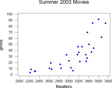 A scatter plot is appropriate when you have two quantitative (measurement
level) variables and you want to see if they're correlated with each other.
- Choose Graph / Plot
- Click in the Y column for graph 1. Double click on the response variable
(gross)
- Click in the X column for graph 1. Double click on the predictor variable
(theaters)
- (Optional - Recommended) Add a title to the graph by choosing Annotation
/ Title
- Click OK
You may have more than one scatter plot on the same graph. If you do this,
you probably want to use the same x variable for both, otherwise things can
get really confusing.
You can also change the color of the dots (click on display item 1 and then
edit attributes) or connect them (change symbol to connect, but that would
be really ugly in this case).
Taking the Log (Question 3)
Fitted Line Plots
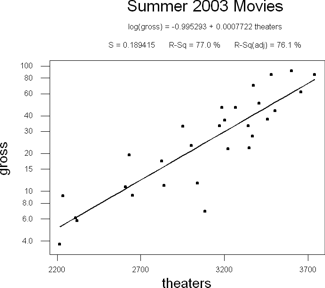 Before
you decide to take the log of one of the variables, you might decide to play
around with the graphs and see if it helps. We can use the Fitted Line
Plot to do this. In this example, I'll take the log of the Y values.
- Choose Stat / Regression / Fitted Line Plot
- Enter the response and predictor variables in the appropriate blanks
- Click on Options
(you probably don't want to take the log of both, it won't accomplish much).
- To take the log of the response variable (gross), check the Logten
of Y and Display logscale for Y variable boxes.
- To take the log of the predictor variable (theaters), check the Logten
of X and Display logscale for X variable boxes.
- (Optional - Recommended) Add a title. This is under the options button.
Notice how much more linear the data is now than it was before? That indicates
that it is a good idea to take the log of the gross sales.
One caveat about
taking the log of values. You can only find the logarithm of positive values.
If you ever have negatives or even zero, you can't apply the logarithm transform.
This means that you should never standardize and then take the log. If you're
going to take the log, do it before you standardize the variables.
Transforming the Variable
If you have decided, like we did, that it would be good to transform both
variables, then we need to calculate the new variable and save it so that we
can use it in the future. In this example, we'll take the log of the gross
sales for the opening weekend. If you decide that you would rather take the
log of the number of theaters, then replace "gross" with "theaters" everywhere
below.
- Label a blank column as log_gross
- Choose Calc / Calculator
- Store the results into log_gross
- The expression is "logt(gross)" without the quotes, obviously. Alternatively,
you can scroll through the list of the functions to find "Log 10", double
click on that, and then double click on gross.
- Click OK
Since we transformed the gross sales using the logarithm
function, we need to make sure that we use log_gross from now on instead of
gross. If you decide not to use the log transform, then continue to use gross
instead of log_gross.
Find Descriptive Statistics (Question 4)
- Choose Stat / Basic Statistics / Descriptive Statistics
- Choose the variables log_gross and theaters.
- (Optional) Go into Graphs and choose Graphical Summary. This will give
you all kinds of interesting information about the variables.
- Click OK
Find Regression Results (Question 5)
Finding Correlation
The regression results will give you a lot of information. Unfortunately,
the one thing it doesn't give you is the value of the correlation coefficient.
We'll find that first and then move on to regression.
- Choose Stat / Basic Statistics / Correlation
- Double click on the variables log_gross and theaters (the order doesn't
matter).
- Click OK
The output will say "Pearson correlation of log_gross and theaters = X"
where the number X is the correlation coefficient. It will also give you a
p-value.
The p-value is the chance of getting the results we did if there is no linear
correlation between our two variables. A small p-value (less than 5% or 0.05)
means that our results are unlikely to happen if there is no correlation and
so there must be linear correlation. A large p-value means that our results
are likely to happen if there is no linear correlation and so it's likely that
there's not any linear correlation.
Be sure to comment on the correlation in
your project.
Finding Regression
- Choose Stat / Regression / Regression
- The response variable is log_gross. The predictor variable is theaters.
- (Optional - Required for Questions 6 and 7) Go into Storage. Check the
boxes next to Residuals
and Fits. Click OK.
- Click OK
There were two new variables that were created. RESI1 and FITS1. These are
the residuals and the fits for this model. If you run this procedure again
without unchecking Residuals and Fits, the variables will be called RESI2 and
FITS2. The number will increment each time you re-run the regression procedure.
Feel free to delete any unused columns by clicking on the column name (C6,
C7, etc) and then hitting delete.
If this is the only residual and fits you have for your worksheet, you may
want to relabel the columns as "residuals" and "fits". My examples will assume
you've done this. If you don't do this, then use "RESI1" and "FITS1" instead.
Create an Annotated Scatter Plot (Question 6)
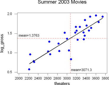 You did store the residuals and fits and relabel them in the last step, didn't
you? If not, this question will be really difficult to do.
- Go to Graph / Plot
- For Graph 1, set the Y to log_gross and the X to theaters
- For Graph 2, set the Y to fits and the X to theaters. Minitab may complain
about changes you made during question 2, go ahead and say it's okay.
- Under the Data Display, there are Items. Right now, only Item 1 has anything
in it. We'll change that. Item 1 should display a Symbol for each Graph.
- Item 2 should be display a Connect for Each graph.
- To add this, click in
the first box in the Item 2 row, then pull down the display menu and
choose connect.
- Click in the second box in the Item 2 row, then pull down the for each
menu and choose graph.
- Click on the Symbol for Item 1 and then Edit Attributes
- Graph 1 should have a solid black circle (change the color if you like,
I changed mine to blue). Optionally change the point size to make them
bigger (I made mine a 1.5)
- Graph 2 should have None for the type.
- click OK
- Click on the Connect for Item 2 and then Edit Attributes
- Graph 1 should have None for the type of line
- Graph 2 should have Solid for the type of line. Change the color and/or
size if you want to (I made my size 3).
- Click OK
- Click on Frame / Multiple Graphs and then choose to overlay graphs on the
same page.
- Click on Frame / Reference
- For item 1, type X in the direction field and the mean number of theaters
in the position field. My mean (from question 4) for the theaters was
3071.3. Optionally change the line type to dashed and the color to red
(or whatever color you like).
- For item 2, type Y in the direction field and the mean number of log_gross
into the position field. The mean (from question 4) for the log of the
gross was 1.3763. Optionally change the line type to dashed and
the color to red (or whatever color you like).
- (Optional - Recommended) Add a title to the graph. Click on Annotation
/ Title
- Click OK. Make sure the graph looks right. If it doesn't fix it before
going on to step 12. Changes made after this step are lost when you recreate
the graph.
- To label the means on the graph, double click on the graph to go into edit
mode.
The Tools and Attributes toolbars will pop up.
- Choose the Text (big T in upper right) of the Tools toolbar.
- Click on the graph where you would like to add text
- Type "mean=1.3763" (except use your numbers) and click OK
- Now drag the text so that it is positioned where you want it.
- Repeat steps a) through d) with the mean of the theaters.
- On the toolbar at the top, there will be a little face with dots coming
out of his eyes. Click that to go back into view mode. Alternatively, choose
Editor / View from the menu system.
Whew! That involved a lot of steps. Make sure you get it right before you
copy and paste it into Word.
Plotting the Residuals (Question 7)
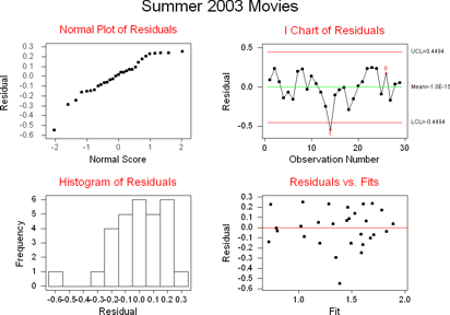 You did generate the residuals and fits and then rename them back in question
5, right? Otherwise, this part will be difficult to do.
- Choose Stat / Regression / Residual Plots
- Use residuals (RESI1 if you didn't rename them) for the residuals and fits
(FITS1 if you didn't rename them) for the fits.
- Click OK
Primarily we're interested in the normal probability plot (the residuals should
be normally distributed) and the residuals vs fits graph (they should be fairly
randomly scattered).
For the most part, they look good. There is that one outlier that opened in
an average number of theaters but did poorly (Sinbad - you can tell by going
back and finding that point in your data).
Fitted line plot of standardized variables (Question 8)
We talked about standardizing the variables on the first technology project
and we've done a fitted line plot here, so there is nothing new here.
Standardizing the variables
- Label two empty columns as z_log_gross and z_theaters
- Go to Calc / Standardize
- Use log_gross and theaters for the input columns.
- Store the results in z_log_gross and z_theaters. Make sure the order is
the same between the input and storage variables (that is, don't input
log_gross and theaters but store into z_theaters and z_log_gross).
- Click OK
Fitted Line Plots
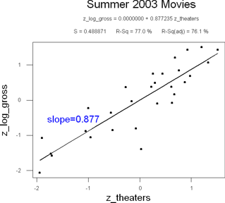 Hey, we're almost done with this. You are remembering to think, show, and
tell, right?
- Go to Stat / Regression / Fitted Line Plot
- Use z_log_gross for the response variable and z_theaters for the predictor
variable.
- Go into Options and make sure that the Logten transforms are turned off
(Minitab remembers that you had them turned on earlier).
- Go into Storage and make sure nothing is checked there.
- (Optional - Recommended) Put a title on the graph. This is in the options
screen.
- Click OK
- Double click on the graph to go into edit mode (or use the menu and choose
Editor / Edit)
- Choose the Text tool (the big T)
and click somewhere close to the line in an empty space
- Type "slope = 0.877" (except use the value you found for the correlation
coefficient in question 5) and click ok
- (Optional) Change the color and size of the text. Click once on the
text to highlight. Click on the rainbow next to the ABC on the attribute
toolbar and pick a color (I chose blue). Click on the two T's right below
that to change the font size. The default is 1. I chose 1.25 to make
it a little bigger.
- Drag the text so that it is viewable.
- Choose Editor / View from the menu system or click on the view icon on
the toolbar (the face with the dots).
Even though you don't have to label the centroid on the graph, be sure to
note how it's at (0,0) in your explanation of the graph.
 A scatter plot is appropriate when you have two quantitative (measurement
level) variables and you want to see if they're correlated with each other.
 A scatter plot is appropriate when you have two quantitative (measurement
level) variables and you want to see if they're correlated with each other.
 Before
you decide to take the log of one of the variables, you might decide to play
around with the graphs and see if it helps. We can use the Fitted Line
Plot to do this. In this example, I'll take the log of the Y values.
 You did store the residuals and fits and relabel them in the last step, didn't
you? If not, this question will be really difficult to do.
 You did generate the residuals and fits and then rename them back in question
5, right? Otherwise, this part will be difficult to do.
 Hey, we're almost done with this. You are remembering to think, show, and
tell, right?