Technology Exercise 4: Randomness & Probability
General Social Survey (Question 1)
Getting the data
- Visit the General
Social Survey website at http://www.icpsr.umich.edu:8080/GSS/homepage.htm
- Click on Analyze
- Select Frequencies or crosstabulation and then click Start
- Enter these values (without the quotes) on the screen that appears.
- The Row variable should be "sex"
- The Column variable should be "race"
- The Filter variable should be "year(2000)"
- Uncheck any percentaging boxes.
- Click Run the Table
Entering the data into Minitab
- Label three empty columns as "sex", "race", and "frequency"
- Enter "male" three times and then "female" three times in the sex column.
- Enter "white", "black", and "other" in the race column. Repeat the sequence
so the whole sequence is there twice.
- Enter the frequencies from the webpage for each pair of categorical variables.
Your data should look something like this (but be sure to use your data from
the year 2000)
| row |
sex |
race |
frequency |
| 1 |
male |
white |
1002 |
| 2 |
male |
black |
144 |
| 3 |
male |
other |
86 |
| 4 |
female |
white |
1239 |
| 5 |
female |
black |
256 |
| 6 |
female |
other |
105 |
Saving the data
- Choose File / Save Project As
- Navigate the file system to the R: drive
- Choose section 01 or 02 as appropriate
- Choose the tech4 folder
- Save your data under a name that is unique to your group.
Be sure to open up this file any time you need to do further work on your
project.
Creating the contingency table
- Choose Stat / Tables / Cross Tabulation from the menu
- The classification variables are sex and race. The one you list first will
be the row variable and the one you list second will be the column variable.
- Check the Frequencies in box and tell Minitab that the frequencies are
in the frequency column.
- Display the Counts and nothing else.
- Click OK
Creating a joint probability distribution
Repeat the above steps for the contingency table, except display the Total
percents. Typically, probability distributions are written as decimals, but
Minitab displays them as percents. Be sure to answer as a decimal when you
answer the questions later.
Creating conditional probability distributions
Repeat the above steps for a contingency table, except display the Row percents
or the Column percents (depending on which conditional percents you want).
After you have created all of the probability distributions, you can use them
to answer the questions.
Demonstrate the Law of Large Numbers (Question 2)
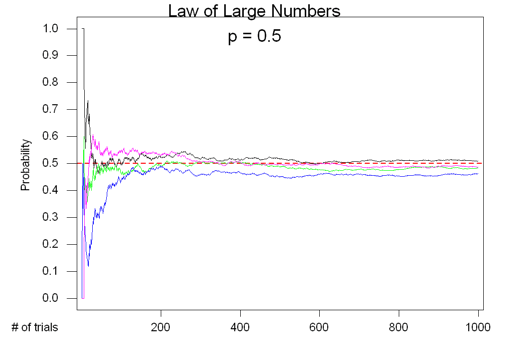
 Your
output for this section will be a graph similar to the one to the right. My
example uses 0.5 as the probability of success for each trial. Be sure you
use the probability given you in class.
Generating the data
- Choose File / New / Minitab Worksheet. This data is so very different from
the last problem that we'll put it in a different worksheet just to keep
it separate.
- Label empty columns as "n", "x1", "x2", "x3", "x4", "p1", "p2",
"p3", and "p4".
- Fill in the numbers from 1 to 1000 into the "n" column
- Choose Calc / Make Patterned Data / Simple Set of Numbers
- Store the patterned data in "n".
- Start with the first value of 1
- Go to the last value of 1000
- Click OK
- Generate the random data
- Choose Calc / Random Data / Bernoulli
- Generate 1000 rows of data
- Store in columns x1, x2, x3, and x4
- Use the probability of success that was given to you. Enter it
as a decimal.
- Click OK
- Find the accumulated probabilities
- Choose Calc / Calculator
- Store the results into "p1"
- The expression is "pars(x1)/n"
- Click OK
- Repeat steps a-d, but change the variables. Use p2 with x2, p3 with
x3, and p4 with x4.
Making the Graph
- Choose Graph / Time Series Plot
- Double click on p1, p2, p3, and p4 to select the variable to graph for
graphs 1, 2, 3, and 4.
- Turn off the symbols. There are too many data points to show symbols.
- Click
on the word Symbol in row 1 of the Display column
- Click Edit Attributes
- Click on the word Type at the top of the first column. This will highlight
the entire column.
- Use the pull down menu button next to the word Type and change the
type to None.
- Click OK
- Change the line style.
- Click on the word Connect in row 2 of the Display column
- Click Edit Attributes
- Make sure each line is solid. If not, click on the words Line Type
at the top of the first column to highlight the entire column, then use
the pull down menu to change the line type to solid.
- (Optional) Change the lines to be different colors. This will print
in black and white, but it will be easier to visualize if you generate
them with different colors. If you want different colors, you'll have
to use the pull down menu separately for each row.
- Click OK
- Place all the graphs on one screen.
- Click on Frame and choose Multiple Graphs
- Check Overlay graphs on the same page
- Click OK
- Add a reference line at your probability so we can see the values getting
close to it.
- Click on Frame and choose Reference
- The direction should be Y
- The position should be your probability
- Make it a dashed red line of size 2
- Click OK
- Add a title by going into Annotation / Title. You should probably add a
second line that includes the probability of success that you're using.
- Relabel the axes
- Click on Frame and choose Axis
- Type "# of trials" for the label for row 1
- Type "Probability" for the label for row 2
- Click OK
- (Optional) Make your graph bigger. By default, Minitab leaves a lot of
extra space on the right and top of the graph that is wasted.
- Click on Regions and choose Data. The default values are 0.2 and 0.8
for both the X and Y variables. The space to the left of 0.2 is used
for labels, but the space to the right of 0.8 is wasted (empty).
- Set the X minimum and maximum to 0.15 and 0.95.
- Set the Y minimum and maximum to 0.1 and 0.95
- These should be reasonable. If you see text getting cut off of the
left, then increase the X minimum. If text is cut off the bottom, then
increase the Y minimum.
- (Optional, recommended) If you find that there are not enough probabilities
listed on the y-axis, you can tell Minitab to list more. For example, when
I ran through this project to create the example, it only gave me values
at 0.0, 0.5, and 1.0. I would really rather have values every 0.1.
- Click on Frame and choose Tick
- Figure out the number of tick marks you want on the y-axis. In my example,
the values go from 0 to 1 and I want them to count by 0.1. That means
I need 11 tick marks (0, 0.1, 0.2, 0.3, 0.4, 0.5, 0.6, 0.7, 0.8, 0.9,
and 1.0).
- For the Y direction (should be row 2), enter the number or ticks you
want as the Number of Major ticks.
- Click OK
- Click OK
Check your graph and make sure everything is okay. If it is, then copy and
paste it into Word.
Jalen Rose (Question 3)
Generating the data
- Create a new worksheet to hold the Jalen Rose data.
- Label two empty columns as "shots made" and "probability"
- The number of shots made can be anywhere from 0 (a really bad game) to
19 (a most excellent game). Jalen can't make less than 0 shots, nor can he
make more than attempts. Fill in the "shots made" column with the whole numbers
from 0 to 19
- Go to Calc / Make Patterned Data / Simple Set of Numbers
- You should be able to figure it out on your own by now.
- Find the probabilities for each of those shots made.
- Choose Calc / Probability Distributions / Binomial
- Choose Probability
- The number of trials is 19
- The probability of success is 0.406
- The input column is "shots made"
- The output column is "probability"
- Click OK
Copying the probability distribution into Word
- Highlight the "shots made" and "probability" columns by clicking on the
C1 and C2 at the top.
- Copy the data
- Switch to Word
- Paste the data.
- Highlight the data in Word
- Add a tab at about 1" so that the data lines up with the headings. To add
a tab, just click on the ruler where you want the tab to go. If the ruler
isn't showing, go to View / Ruler.
As an alternative, you can go to Manip / Display Data in Minitab. Display
both variables and then you can copy and paste into Word as normal. This includes
the row number, which isn't necessary, which is why I gave the previous instructions.
Making a graph
- Choose Graph / Plot
- The Y variable should be "probability"
- The X variable should be "shots made"
- Add a title by choosing Annotation / Title
- Fix the scale on the X axis so that it goes from 0 to 19
- Click on Frame and choose Min and Max
- Change the X minimum to be -0.5 and the X maximum to be 19.5. It is
necessary to subtract and add 0.5 for the graph to appear properly.
- Click OK
- Fix the tick marks for the X axis so that they appear for every value.
- Click on Frame and choose Tick
- For the X direction (should be row 1), tell Minitab that you want the
Number of Major ticks to be 20 (there are 20 numbers when you start at
0 and count to 19).
- (Optional) - change the ticks on the Y axis. You really won't know
what to change them to until you've generated the graph, so you may want
to leave this alone the first time through and come back and revisit
it later.
- Click OK
- (Optional, Recommended) Change the color and size of the symbols by clicking
on Edit Attributes and making the changes. A point size of 1.5 works out
nicely.
- Make the graph take up more of the available space.
This may be necessary so that you can see all of the values on the x-axis.
- Click on Regions / Data
- Set the X minimum and maximum to 0.15 and 0.95
- Set the Y minimum and maximum to 0.10 and 0.95
- Click OK
 Your
output for this section will be a graph similar to the one to the right. My
example uses 0.5 as the probability of success for each trial. Be sure you
use the probability given you in class.
 Your
output for this section will be a graph similar to the one to the right. My
example uses 0.5 as the probability of success for each trial. Be sure you
use the probability given you in class.