Creating Conics with Derive
This tutorial is designed to help you create conic sections with Derive. For
more information on the conic sections themselves, see my College Algebra handouts
and notes. These helps are only for conics in rectangular form and don't include
conics in polar form.
Graphing in Rectangular Form in Derive

- Make sure you're in the Algebra window.
- Enter the equation into the expression window at the bottom of the screen
and press enter when done.
Here are some examples:
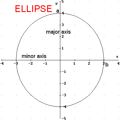
- Ellipse: x^2 / 9 + y^2 / 16 = 1
- Hyperbola: x^2 / 9 - y^2 / 16 = 1
- Parabola: x^2 = y
- Choose Insert / 2D-plot Object
- Choose Set / Coordinate System / Rectangular
- Set your viewing window by doing one of the following. You can come back
and change it later if you don't have it right.
- Choose Set / Plot Range (control-R) to specify the minimum and maximum
x and y settings and the number of intervals (tick marks) for each direction.
This is like the TI calculators except that instead of specifying how
often you want tick marks, you specify how many tick marks (note, you
will get 1 more tick mark than the number of intervals). Basically, number
of intervals is (maximum - minimum) / frequency. For example, if you
want to go from -8 to 8 and put a tick mark at every other point, you
would specify -8 for the minimum, 8 for the maximum, and 8 for the number
of intervals (16/2=8).
- Choose
Set / Plot Region (control-N) to specify your viewing window based
on center, length in x and y directions, and number of intervals (tick
marks). For example, if you want to go from -8 to 8 and put a tick mark
every other point, your length would be 16, center is 0, and intervals
is 8.
- (Optional) If you would like a square viewing window (where the aspect
ratio is 1:1), then choose Set / Aspect Ratio (control-A) and enter 1 : 1.
You may want to grab the corner of the window and make it fill most of the
screen before you do this, because this command will shrink the window to
match your aspect ratio.
- Set up the proper graph by choosing Options / Display
- Choose the Cross tab and turn off the cross display
- Derive changes the plot colors with each new plot. You can force the
color of the next plot by choosing the Plot Color tab. If you always
want the same colors, then go into Options and turn off the Change Plot
Color option.
- Choose Insert / Plot (F4) to actually graph the equation.
- Change your viewing window (see #5) if you need to do so.
- Choose File / Update (control-U) to update the graph in the main Derive
file. This step is really optional, but if you embed it, you can come back
to it later and change it without having to go through and recreate it all
from scratch. This will also let you save the images so that one team member
can create the images and another can do the typing. Then the one doing the
typing can open the Derive file and copy / paste into the Word document.
- (Optional) Annotate the image by choosing Insert / Annotation (F12). This
allows you to add text or other labels to your graph. If you want to label
the a, b, or c on the graph of perhaps the major
and minor axes, this is the way to do it.
- You will probably want to change the Font for your annotation. The
default font is the Derive For Windows (DFW) font and only 10 point.
Arial or Times New Roman and 14 point or larger is probably a better
choice.
- You can drag the annotation to the proper location on the graph after
you've created it.
- Be sure to update the graph (control-U) so that your changes get made
on the embedded graph in the document. You will probably notice that
once you update the graph, the annotations that they don't look right.
That
is, the annotation is not in the location
you specified. If you will drag the box in the algebra window a little bigger
and then go back to the graph and update, it will look better. Having
the larger graph in the algebra window also helps later when you go to
copy/paste so that the resolution is better. The graph will definitely
look grainy (poor resolution) if you don't update after you drag the
window larger in the algebra window.
Graphing in Polar Form

- Make sure you're in the Algebra window.
- Enter the equation into the expression window at the bottom of the screen
and press enter when done. Here are some examples:
- Ellipse: r = 6 / ( 3 + 2 cos(theta) )
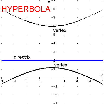
- Hyperbola: r = 6 / ( 2 + 3 sin(theta) )
- Parabola: r = 5 / (1 - cos(theta) )
- Enter the equation of your directrix. Here are some examples:
- Vertical line: r = 3 sec(theta)
- Horizontal line: r = 2 csc(theta)
- Highlight the equation of the conic.
- Choose Insert / 2D-plot Object
- Choose Set / Coordinate System / Polar
- Set your viewing window by doing one of the following. You can come back
and change it later if you don't have it right.
- Choose Set / Plot Range (control-R) to specify the minimum and maximum
x and y settings and the number of intervals (tick marks) for each direction.
This is like the TI calculators except that instead of specifying how
often you want tick marks, you specify how many tick marks (note, you
will get 1 more tick mark than the number of intervals). Basically, number
of intervals is (maximum - minimum) / frequency. For example, if you
want to go from -8 to 8 and put a tick mark at every other point, you
would specify -8 for the minimum, 8 for the maximum, and 8 for the number
of intervals (16/2=8).
- Choose Set / Plot Region (control-N) to specify your viewing window
based on center, length in x and y directions, and number of intervals
(tick marks). For example, if you want to go from -8 to 8 and put a tick
mark every other point, your length would be 16, center is 0, and intervals
is 8.
- (Optional) If you would like a square viewing window (where the aspect
ratio is 1:1), then choose Set / Aspect Ratio (control-A) and enter 1 : 1.
You may want to grab the corner of the window and make it fill most of the
screen before you do this, because this command will shrink the window to
match your aspect ratio.
- Set up the proper graph by choosing Options / Display
- Choose the Cross tab and turn off the cross display
- Derive changes the plot colors with each new plot. You can force
the color of the next plot by choosing the Plot Color tab. If you always
want the same colors, then go into Options and turn off the Change
Plot Color option.
- Choose Insert / Plot (F4) to actually graph the equation.
- It will ask you for the minimum and maximum values for the parameter
theta. The defaults are -pi to pi. You may want to change those for other
polar graphs, but they will generate the entire conic.
- For the plot mode, choose line for an ellipse or parabola and points
for a hyperbola. If you choose line for a hyperbola, it will try to connect
the ends of the hyperbola and end up drawing the asymptotes. If you choose
points, then put in a really large number like 640 for the number of
points. That will help smooth out the curve and make it look continuous.
- Change your viewing window (see #7) if you need to do so.
- Switch back to the algebra window and highlight the equation of the directrix.
- You may wish to chang the color (see #9) for the directrix
- Choose Insert / Plot (F4) to graph the directrix.
- Choose File / Update (control-U) to update the graph in the main Derive
file. This step is really optional, but if you embed it, you can come back
to it later and change it without having to go through and recreate it all
from scratch. This will also let you save the images so that one team member
can create the images and another can do the typing. Then the one doing the
typing can open the Derive file and copy / paste into the Word document.
- (Optional) Annotate the image by choosing Insert / Annotation (F12). This
allows you to add text or other labels to your graph. If you want to label
the a, b, or c on the graph of perhaps the transverse
or conjugate axes, this is the way to do it.
- You will probably want to change the Font for your annotation. The
default font is the Derive For Windows (DFW) font and only 10 point.
Arial or Times New Roman and 14 point or larger is probably a better
choice.
- You can drag the annotation to the proper location on the graph after
you've created it.
- Be sure to update the graph (control-U) so that your changes get
made on the embedded graph in the document. You will probably notice
that once you update the graph, the annotations that they don't look
right. That is, the annotation is not in the location you specified.
If you will drag the box in the algebra window a little bigger and
then go back to the graph and update, it will look better. Having the
larger graph in the algebra window also helps later when you go to
copy/paste so that the resolution is better. The graph will definitely
look grainy (poor resolution) if you don't update after you drag the
window larger in the algebra window.
