Minitab Notes for Activity 1
You do not need to print out any of the graphs that you generate for this
activity. Just look at them on the screen and answer questions based off of
them in the activity. There is one graph (the histogram) that you need to
copy onto your paper.
Creating the Worksheet
This step can be skipped if you go to File / Open
Worksheet and open the walk.mtw file the instructor created for you. This
section is still good reading for you to learn about creating worksheets,
though.
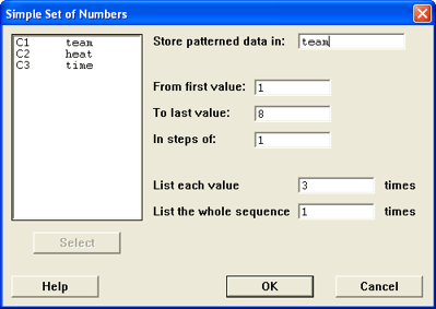 There is a little bit of setup that you need to do
before entering the data. Minitab can also help by creating some of the
values for you.
- Label the columns as team, heat, and
time.
- Have Minitab automatically enter the team data for you.
- Choose Calc / Make Patterned Data / Simple Set of Numbers
- For the team column, the values go from 1 to the number
of teams (shown as 8 in the figure) and each value should be repeated 3
times since there are 3 heats for each team.
- Click OK
- Have Minitab automatically enter the heat data for you.
- Choose Calc / Make Patterned Data / Simple Set of Numbers
- For the heat column, the values go from 1 to 3 since
there are 3 heats for each team. Each value is listed only once, but the
whole sequence is repeated for each team (8 in our example).
- Click OK
- Enter the time data yourself
- Save the Project
- Choose File / Save Project As
- Change to the R: drive and into the proper folder for your section (01,
02, or 03).
- Change into the act1 folder
- Type a file name that is unique to your group.
- Click Save
Summarizing the Data (Question 2)
Once you have your data entered into Minitab, you may work with it. One
of the most common things we will do is display the descriptive
statistics.
Display Descriptive Statistics is the option in Minitab
that we will use more than any other. As such, it's at the top of the menu
choices. Whenever you see "describe" or "summarize" in
the instructions, there's a good chance you should head for Stats / Basic
Statistics / Display Descriptive Statistics.
This screen will give you the following statistics by default.
- N = Sample Size
- N* = Number of missing cases
- Mean = Mean
- SE Mean = Standard Error of the Mean
- StDev = Standard Deviation
- Minimum = Minimum
- Q1 = 1st Quartile
- Median = Median
- Q3 = 3rd Quartile
- Maximum = Maximum value
You can change the statistics that are given by clicking on the
statistics button. In particular, the N* and SE Mean won't be used right
now. The SE Mean will be used in later chapters, but the number of missing
cases is rarely used. Other options in the statistics menu that we will use
occasionally are the variance, range, interquartile range, and sum of
squares.
You may describe more than one variable at a time. However, in this
problem, we only have one variable, time, that we want to
describe. The other two variables are categorical variables used for
classification purposes only, it would make no sense to describe them.
Sample output from the descriptive statistics command is shown in the
figure.
Using All of the Data (for the "Combined" Column)
This is the way to describe the time for all of the
teams and all of the heats.
- Go to Stat / Basic Statistics / Display Descriptive Statistics
- Select the time column for the variables section
- Click on Statistics
- Turn on the box for variance
- Turn off the box for N Missing and SE Mean.
- Click OK
- Click OK
You should get some output that looks something like this.
Descriptive Statistics: time
Variable   N   Mean  StDev  Variance  Minimum     Q1  Median     Q3  Maximum
time      42  5.949  0.987     0.975    4.040  5.130   6.025  6.493    8.600
Grouping the Data by Another Variable (for the "heats 1, 2, &
3" columns)
 This is the way to describe the time for
each of the heats. We use the "By Variable"
option to do this. The column used for the By Variable should be a
categorical variable such as the gender, race, age group (but not age as a
number), or heat number. There should be few categories for
this variable, do not use variables that have large numbers of unique values
for the By Variable. Do not use measurement variables (height, weight, age,
time) as the by variable.
- Go to Stat / Basic Statistics / Display Descriptive Statistics
- Select the time column for the variables section
- Check the By Variable box
- Tell Minitab to describe the data by the variable
heat.
- Check the Statistics box to make sure variance is turned on (Minitab
remembers that you turned it on during the last time you did a display
descriptive statistics).
- Click OK
A common mistake people make after doing this activity
is that they always want to put something in the "by variable"
box. Most of the time, you don't want to break you data down by categorical
variable and the "by variable" should be left blank.
Histogram (Question 3)
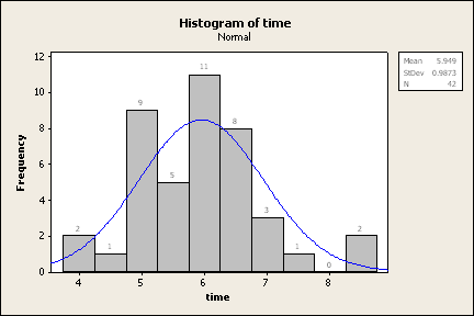 A histogram is a good way to look
the data and see where it lies. We can also use it to let Minitab count the
number in each group for us, rather than us having to do it manually.
Create the Basic Histogram
- Go to Graph / Histogram
- You have choices for the type of histogram that you want. Most of the
time, we will use the simple one or the with fit graph. The fit tries to fit
a normal distribution to the data and can be useful for determining whether
or not the data comes from a normally distributed population. This is
addressed in this unit but it becomes very important later on in the book.
Go ahead and choose the with fit for now.
- Select time as the graph variable
- Click on Labels
- Under Title / Footnotes, you can add text to describe the graph.
- Under Data Labels, Check the use y-value labels radio button so that it
will label the graph with the frequency of each bar.
- Click OK to generate the histogram.
Normally, we would let Minitab just automatically assign groups for us,
but in this case, we're specifically looking for bars that are one standard
deviation wide. That means that we're going to have to do some extra work
that we wouldn't normally have to do.
For this example, let's assume that we're working with the same data we
had earlier and that the mean is 5.949 and the standard deviation is
0.987.
Find the mean minus three times the standard deviation and the mean plus
three times the standard deviation: 5.949 - 3(0.987) = 2.988 and 5.949 +
3(0.987) = 8.910. These numbers correspond to our lowest and highest class
boundaries and will be used later. Notice that our data falls within this
range since our minimum is 4.04 and our maximum is 8.60. If our data
extended beyond ±3 standard deviations, then we would need to extend
those ranges to fit all of the data.
The old version of Minitab (version 13) would allow you to set all kinds
of options before you generated the graph. The new version (version 14)
allows you to look at the graph and then play with the settings. There's
arguments in favor of both directions, but for most people, the new way is
probably better. The rest of this will involve changing the graph to give us
what we want to have.
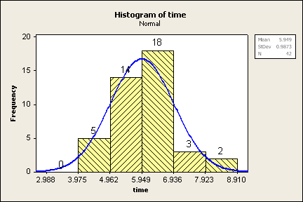 The graph to the right is the modified version that we're
interested in.
- Double click the left mouse button on the bars of the histogram.
- (Optional: Recommended) Under the Attributes menu, you can make the
following changes to format the bars of the histogram. By default, the bars
are not shaded, so it can be difficult to see them. You can change that by
following these steps.
- For the Fill pattern, click Custom
- Change the type (I like the right slant)
- Change the color (or use automatic)
- Click on the Binning tab
- Change the interval type to Cutpoint
- Select "Midpoint/Cutpoint positions"
- In the positions box, enter something like the following (without
quotes) "2.988:8.910/0.987". That notation is the minimum :
maximum / width (but without spaces). You could alternatively enter the
boundary for each bar and separate them by spaces. Use your
data, not the 2.988:8.910/0.987, that is only for the example here
in the instructions.
- You can also modify any part of the graph by double clicking on it. That
way, you could have individual bars have different shading or different
colors. You can also make the fonts bigger so they are easier to read.
Save Your Work (optional - not recommended for this activity)
Since the file "walk.mtw" was already provided for you, you
will probably be okay without saving a project file for this activity.
There's not much work that wouldn't be easy to recreate if you messed up and
had to go back.
For other projects, be sure to save your work! This allows you to go
through and work on the activity incrementally (you can do part of it one
day and finish it another day). All open windows are saved when you save the
project, but if you close a graph, it won't be saved. When you are
completely done with the project, you may wish to close the graphs. This
will make the files smaller and keep us from running out of room on the
drive.
Percent of Data within 1, 2, and 3 Standard Deviations (Question 4)
Once you have this histogram created, this chart is easy to finish.
- Start at the mean and go one standard deviation to either side. There
are 14 values within one standard deviation to the left and 18 within one
standard deviation to the right, so there are a total of 32 values within
one standard deviation (either side) of the mean. 32 out of a total of 42 is
about 76.2%, so there approximately 76.2% of the data lies within one
standard deviation of the mean.
- Start at the mean and go two standard deviations to either side. There
are 19 (14+5) values within two standard deviations to the left and 21
(18+3) values within two standard deviations to the right, so there are a
total of 40 values within two standard deviations (either side) of the mean.
40 out of a total of 42 is about 95.2%, so approximately 95.2% of the data
lies within two standard deviations of the mean.
- Start at the mean and go three standard deviations to either side. There
are 19 (14+5+0) values within three standard deviations to the left and 23
(18+3+2) values within three standard deviations to the right, so there are
a total of 42 values within three standard deviations (either side) of the
mean. 42 out of a total of 42 is 100%, so 100% of the data lies within three
standard deviations of the mean.
| % of values |
w/in 1 st dev |
w/in 2 st devs |
w/in 3 st devs |
| Our Sample Data |
76.2% |
95.2% |
100% |
| Empirical Rule |
approx 68% |
approx 95% |
approx 99.7% |
| Chebyshev's Rule |
not applicable |
at least 75% |
at least 88.9% |
Does the Empirical Rule (the 68-95-99.7 rule) apply?
 Hmmm, good question. The amount within 2 and 3
standard deviations is pretty close, but the amount within one standard
deviation is off by about 8%.
The whole 68-95-99.7 thing is approximate anyway, and it's meant to help
you determine if the data is normally distributed. The normal model is
talked about in chapter 5 and so we won't dwell on it too much right now,
but there are other things we can look at, of course, we just don't know
about them yet. So, if you take the time to read this section, you'll be
ahead of the game for later.
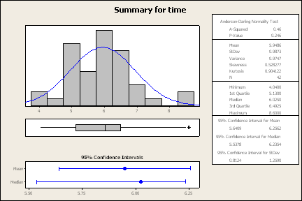
To the right is a graphical summary (Stats / Basic Statistics / Graphical
Summary) for the time variable.
Here are some things to help you decide if the data is normally
distributed.
The Anderson Darling Normality Test is designed to test the claim that
the data comes from a population that is normally distributed (unimodal,
symmetric, bell-shaped, no outliers). The p-value is the likelihood of
getting the results we got if the data has a normal distribution. Typically,
as long as the p-value is more than 5% (0.05), there's no reason to question
the normal distribution. In this case, the p-value is 0.246, so we'll retain
the claim that the dat is normally distributed.
The skewness is a measure of the symmetry of a graph. A symmetric graph
has a skewness of 0, here the skewness is 0.528277, so it's a little skewed
to the right of the mean.
The kurtosis is a measure of the peakedness of a curve. A normal curve
has a kurtosis of 0, a negative value means it is flatter than a normal
model and a value greater than 0 means it is sharper than a normal model.
The kurtosis for our data is 0.904122, which indicates that our data may be
more peaked than what we would like.
Notice I didn't really answer the question. That's because in statistics,
there isn't always a definite answer. We deal a lot with levels of gray.
Later, we'll make an assumption that our data comes from a normal population
and base our decisions on that assumption. All in all, our data is close
enough to not cause problems with that assumption.
Analysis of Variance (Question 5)
The Analysis of Variance is used to test whether or not three or more
means are the same. The response variable is the variable whose value you're
testing and the factor variable is a categorical variable used to define the
groups.
- Choose Stat / ANOVA / One-Way. Note: Do not choose One-Way
(Unstacked)
- The response variable is time
- The factor variable is heat
- Click OK
Sample Data
The sample data that I used to create the graphs above is from the Spring
2005 semester. There were two sections of Math 113 and there ended up being
14 teams of 3 people each. The data is available if
you would like to look at it or use it.
You can copy and paste the data into Minitab. If it asks you whether to
use spaces as delimiters or paste it as a single column, use the spaces as
delimiters. That works since there are no spaces in the data.
If you have spaces in the data, then you can copy from Internet Explorer
into Microsoft Excel, then copy from Excel and paste it into Minitab.
If you are using Firefox instead of Internet Explorer, then you can copy
directly from the web page to Minitab without any problems or additional
questions.
 There is a little bit of setup that you need to do
before entering the data. Minitab can also help by creating some of the
values for you.
 This is the way to describe the time for
each of the heats. We use the "By Variable"
option to do this. The column used for the By Variable should be a
categorical variable such as the gender, race, age group (but not age as a
number), or heat number. There should be few categories for
this variable, do not use variables that have large numbers of unique values
for the By Variable. Do not use measurement variables (height, weight, age,
time) as the by variable.
 A histogram is a good way to look
the data and see where it lies. We can also use it to let Minitab count the
number in each group for us, rather than us having to do it manually.
 The graph to the right is the modified version that we're
interested in.
 Hmmm, good question. The amount within 2 and 3
standard deviations is pretty close, but the amount within one standard
deviation is off by about 8%.