Creating Graphs for Mathematical Notation
Making a Normal Distribution Graph
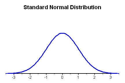 This section will give you the basics needed to create a Standard Normal curve.
You'll use this part to create the basic graph in each case and then make modifications
listed in the other sections.
This section will give you the basics needed to create a Standard Normal curve.
You'll use this part to create the basic graph in each case and then make modifications
listed in the other sections.
When you are done with this section, the graph will look like the graph to
the right.
- Label two columns of the worksheet as z and p
- Choose Calc / Make Patterned Data / Simple Set of Numbers
- Store the patterned data in z
- Start at -3.5
- Go to 3.5
- Use a step size of 0.05 (you can get a smoother curve by using a
smaller step size of 0.02 or 0.01)
- Choose Calc / Probability Distributions / Normal
- Choose Probability Density
- The input column is z
- The storage is p
- Choose Graph / Scatterplot / With Connect Line
- The y variable is p and the x variable is z
- Choose Scale
- Under Axes and Ticks, uncheck all boxes for the high y-scale
and the high x-scale. Check all boxes for the low x-scale. The
only box that should be checked under the low y-scale is the
axis line.
- Choose Data View
- Under Data Display, turn off the Symbols
- Click OK to generate the graph
- Now comes the fun part, we get to clean up the graph and annotate it! Make
sure your graph is essentially correct before continuing. If you have to
go back and re-generate the graph using a scatterplot, you will lose all
annotations.
- Most of these involve editing a piece of the graph. There are a few ways
to do this. You can 1) double left click the item, 2) position your mouse
over the item, click the right mouse button, and choose Edit, or 3) left
click on the item and then press Control-T on the keyboard (or choose the
right mouse button and pick edit). The instructions below will just say "edit
this part of the graph" and you can use any of the methods to perform
the edit.
- To clean up the labels we don't want, click on the "p" on
the left side of the graph and delete it. Do the same thing for the "z" at
the bottom of the graph.
- Edit the normal curve
- Change the line type to custom with a size of 3
- Edit the y axis scale on the left side of the graph (there are no
numbers, just click on the axis line at the left)
- Under Scale, change the minimum scale range to 0 and the maximum
scale range to 0.6. This part isn't crucial, but it helps flatten
out the curve some.
- Under Show, uncheck all boxes, we don't want a vertical axes
at all
- Edit the x axis scale at the bottom of the graph
- Under Scale, change the minimum scale range to -3.5 and the
maximum scale range to 3.5
- Under Attributes, change the line size to 2
- Under Font, change the font to Arial and the font size to 14
- Edit the title and change the font to Arial and the font size to
20 points. An appropriate title for the basic graph might be "Standard
Normal Distribution" but use something appropriate for the graph you're
making.
- Edit the box outside the graph region. By default it is grey, but
we would like it to be transparent.
- Change the fill pattern to custom and set the type to none. To
get to the no fill, you'll actually have to scroll up the pull
down list to the box with the N in the middle.
- Change the borders and fill lines to custom and then change the
type to none.
Customizing the Graph
 At
this point, we are ready to start adding things to the graph, rather than just
changing what is there. There is a graph annotation toolbar that is active
while you're editing a graph. If the toolbar does not appear on your screen,
then go to Tools / Toolbars / Graph Annotation Tools and turn it on. Until
this point, we have been using the Select Mode (the arrow), but now we're going
into insert Text (the T) or a Lines (the line). Click on the appropriate mode
to insert the right object. Here are generic instructions for each type of
object.
At
this point, we are ready to start adding things to the graph, rather than just
changing what is there. There is a graph annotation toolbar that is active
while you're editing a graph. If the toolbar does not appear on your screen,
then go to Tools / Toolbars / Graph Annotation Tools and turn it on. Until
this point, we have been using the Select Mode (the arrow), but now we're going
into insert Text (the T) or a Lines (the line). Click on the appropriate mode
to insert the right object. Here are generic instructions for each type of
object.
- Inserting Text
- Click the T from the graph annotation toolbar
- Click on the graph where you would like the upper left corner of
the text to be (this can be changed later)
- Type the text
- Click OK
- After the text is on the screen, you can edit it, change the font
(to Arial), color, or size. You can also drag it to a new location
on the screen since it is very unlikely that you will get it where
you want it the first time
- Fine control over the position of the text can be obtained by using
the arrow keys or shift arrow (for medium control).
- Inserting Lines
- Click on the Line on the graph annotation toolbar
- Click (and hold) the left mouse button where you would like the line
to start
- Drag the mouse to where you would like the line to end. You can force
a horizontal, vertical, or diagonal (45 degree) line by holding the
shift key down while dragging. Let up on the mouse button when you
reach the destination.
- If you don't get the line exactly where you want it, you can drag
the line once it's on the screen. You can lengthen the lines by draging
the ends, but be careful because the shift key doesn't keep it horizontal
or vertical when at this point.
- You can then edit the line to change the type, color, or size, or
add arrows
- Fine control over the position of the line can be obtained by using
the arrow keys or shift arrow (for medium control)
- Shading a region
- Click on the Polygon on the graph annotation toolbar (on the far right)
- Click at certain key points along the graph
- When you are done, position the cursor above (or below) the initial point, then double click to close the polygon
- You can then edit the graph and make it look like you want it to
Empirical Rule Graph (Chapters 5 - 6)
 Begin by creating the Standard Normal Distribution as described at the top of this document. Then we'll edit it to make it look like the graph to the right.
- Edit the title.
- Right click somewhere on the graph and choose Add / Reference Lines
- The reference lines for the X positions are -3 -2 -1 0 1 2 3 (separate them with spaces)
- Edit any of the reference lines
- Change the line type to custom.
- Make it a dashed line
- Check the box that says Apply same attributes to all reference lines
- Click on the Show tab
- Tell it None for Show Label
- Apply same label option to all reference lines
- Use the instructions above from the Customizing the Graph to draw the green horizontal lines and label them with the percents.
Copying the Graph into Word
This is similar to what you do when you do the technology projects.
- Right click the mouse and choose Copy Graph
- Switch to your Microsoft Word document
- Paste the graph into Word.
It will take up most of the page, but we'll resize it.
- Right click the mouse on the graph and choose Format Picture
- Choose Size and set the width to 2"
- Choose Layout and choose Square and then set the horizontal alignment
to Right
- Click OK
- Drag the picture to where you want it to be.
Hypothesis Test Graph (Chapters 7 - 8)
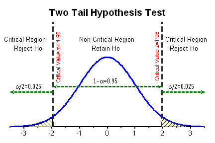 Begin by creating the Standard Normal Distribution as described at the top of this document. Then we'll edit it to make it look like the graph to the right.
Add reference lines to the graph for the critical values
- Right click somewhere on the graph and choose Add / Reference Lines
- The reference lines for the X positions are -1.96 1.96 (separate them with spaces). Note that the critical values are not always 1.96 and -1.96, they depend on the distribution being used and whether it is a one tail or two tail test.
- Edit the reference
line at 1.96.
- Under Attributes, select a Custom line type of dashed lines
with a thickness of 2. Check the box that says to apply attributes
to all reference lines to save having to do this to the other
line at -1.96
- Edit the text that says 1.96.
- Change the text from 1.96 to "Critical Value z=1.96"
- Under font, change the font to Arial, the color to red and
the font size to 12. Check the box to apply font changes to
all reference lines
- Under alignment, set the text angle to 90 degrees, choose
a custom position and make it "Below, to the left"
- Edit the text for the reference line at -1.96 (NOTE: You will not have a second
reference line for a one tail test).
- Change the text to "Critical Value z=-1.96"
- Under alignment, set the text angle to 90 degrees, choose
a custom position and make it "Below, to the right
- Edit the title.
- Use the instructions above under "Customizing the Graph" to follow the rest of these instructions. Insert the horizontal lines for the areas. You will need three of them,
one for the left portion, one for the middle, and one for the right. For
each line, do the following.
- Change the style to small dashes, the color to dark green, the thickness
to 2 and add arrows where appropriate.
- Use the mouse or arrow keys to carefully align the lines with each
other
- Insert the labels for "Critical Region", "Non-Critical Region", "Retain
Ho", and "Reject Ho". There is not an easy way to put in an
H0, so just use a lowercase O so it is close.
- Change the font to Arial
- Change the font size to 14.
- The labels for the areas require changing fonts and your output won't look
exactly like mine because I made it much harder than it needs to be.
- Insert text that says "1-a=0.95" and "a/2=0.025".
That is, use the a instead of an alpha (α). We'll change the font in the next step so it shows up as an alpha.
- Then edit the text and set the font to Symbol and make the size 12. That will change the a into an alpha.
- To shade the critical region, use the closed polygon tool (last one on right) and click along the shaded part. You may need to practice a couple of times to get it looking right. See the "shading a region" part above.
- Don't close your graph out. Make sure you save it as part of your project.
But when you're all done, copy and paste it into Word. See "Copying the Graph into Word" under the Empirical Rule section.