Creating Probability Distribution Graphs
Creating the x values (horizontal axis)
- Choose Calc / Make Patterned Data / Simple Set of Numbers
- Store the patterned data in x
- Enter the left hand value of the graph for the first value
- Enter the right hand value of the graph for the last value
- The step size depends on the type of distribution.
- For a discrete distribution like the binomial that only has integer
values, use 1.
- For a continuous distribution like the normal, t, chi-square, or F, use
a small value like 0.05 or 0.02. The smaller the value, the smoother the
curve will be.
- Click OK
Creating the y values (vertical axis)
- Choose Calc / Probability Distributions and then select the name of the
distribution you're wanting to graph. This can be normal, t, chi-square, or
F.
- Check the box for probabilty density. This is the height (y-value) of
the curve. The cumulative probability tells you the area to the left of the
x value and the inverse cumulative probability tells you the x-value when
you know the area to the left of the value.
- Enter any required parameters
- Binomial: Enter the number of trials and probability of success on each
trial (called event probability)
- Normal: There are no required parameters that need changing. Leave the
mean at 0 and standard deviation at 1.
- T: Enter the degrees of freedom. Leave the non-centrality parameter at
0.
- Chi-square: Enter the degrees of freedom. Leave the non-centrality
parameter at 0.
- F: Enter the numerator degrees of freedom and the denominator degrees of
freedom. Leave the non-centrality parameter at 0.
- The input column is x
- The optional storage is p (for probability, although you could call it y
if you like)
- Click OK
Creating the Graph
This part depends on whether your distribution is discrete and has only
integer values or is continuous and is a curve.
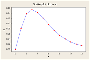
Discrete Distributions (Binomial)
- Choose Graph / Scatterplot / Simple
- The y variable is p (unless you named it y)
- The x variable is x
- Click OK
Continuous Distributions (Normal, T, Chi-square, F)
- Choose Graph / Scatterplot / With Connect Line
- The y variable is p (unless you named it y)
- The x variable is x
- Click on Data View and check Connect line but uncheck Symbols
- Click OK
Optional Choices for Either Type
Here are some things you can do when you're first creating the graph. You
don't have to do any of them now because you can do them after the graph is
done as well. These should be done before you click OK to create the
graph.
- Scale / Axes and Ticks: This is where you can turn off some of the axes
like the top line for the x-axes or the left and right axes for the y. Be
careful about turning off the y axes, though, we'll need it later to change
things. But it's a good idea to go ahead and turn off the high x-axes
line.
- Labels: You can the title on the graph or add a secondary title.
Cleaning Up the Graph
You can double click any part of the graph to edit it.
- Y-Scale: Double click on a number on the y-axis. You can click anywhere
on the y-axis, but a number is bigger and easier to hit.
- Under Scale Range, uncheck the Auto button for the minimum value change
the minimum value to be 0. You may want to change the maximum y-value as
well. For the normal distribution, I use 0.6 to flatten the curve out a
little bit (the default maximum is 0.42288).
- Click on the Show tab at the top and uncheck all the values.
Alternatively, you can just delete the y-axis when you're done editing
it.
- Click OK
- X-Scale: Double click on a number on the x-axis.
- Under Scale Range, uncheck the Auto button for the minimum and maximum
values and set them to be the left edge and right edge of your graph.
- Click on the Show tab at the top and uncheck the High Axis line.
- [Optional] Click on Font and change the font size to something a little
larger. You can also change the font to Arial or some other font if you
prefer.
- X-axis label: Click once on the "x" at the bottom and then
press the delete key. You may also right click and choose delete.
- Y-axis label: Click once on the "p" at the left and then press
the delete key. You may also right click and choose delete.
- Title: Double click on the title and change it if you didn't already do
so under the optional section above.
- Thicken the curve (points): Double click on the curve (points) and then
change to a Custom type. Play around with the size so that it is larger and
easier to see. A size of 3 is usually pretty good for the line.
- Double click in the gray area outside the graph region. We would like it
to be transparent.
- Change the fill pattern to custom and set the type to none. To get to
the no fill, you'll actually have to scroll up the pull down list to the box
with the N in the middle.
- Change the borders and fill lines to custom and then change the type to
none
Annotating the Graph
 At this point, we are ready to start adding
things to the graph, rather than just changing what is there. There is a
graph annotation toolbar that is active while you're editing a graph. If the
toolbar does not appear on your screen, then go to Tools / Toolbars / Graph
Annotation Tools and turn it on. Until this point, we have been using the
Select Mode (the arrow), but now we're going into insert Text (the T) or a
Lines (the line). Click on the appropriate mode to insert the right object.
Here are generic instructions for each type of object.
Inserting Text
- Click the T from the graph annotation toolbar
- Click on the graph where you would like the upper left corner of the
text to be (this can be changed later)
- Type the text
- Click OK
- After the text is on the screen, you can edit it, change the font (to
Arial), color, or size. You can also drag it to a new location on the screen
since it is very unlikely that you will get it where you want it the first
time
- Fine control over the position of the text can be obtained by using the
arrow keys or shift arrow (for medium control).
Special Text
Occasionally, you will need to create a special symbol like the Greek
letter alpha, α. To do this, type the letter a and then change the
font to be Symbol. The Symbol font contains the Greek letters that match up
(mostly) with the Roman letters.
Inserting Lines
- Click on the Line on the graph annotation toolbar
- Click (and hold) the left mouse button where you would like the line to
start
- Drag the mouse to where you would like the line to end. You can force a
horizontal, vertical, or diagonal (45 degree) line by holding the shift key
down while dragging. Let up on the mouse button when you reach the
destination.
- If you don't get the line exactly where you want it, you can drag the
line once it's on the screen. You can lengthen the lines by draging the
ends, but be careful because the shift key doesn't keep it horizontal or
vertical when at this point.
- You can then edit the line to change the type, color, or size, or add
arrows
- Fine control over the position of the line can be obtained by using the
arrow keys or shift arrow (for medium control)
Shading a region
- Click on the Polygon on the graph annotation toolbar (on the far
right)
- Click at certain key points along the graph
- When you are done, position the cursor above (or below) the initial
point, then double click to close the polygon
- You can then edit the graph and make it look like you want it to
Help! My Graph Doesn't Look Right
Here are some common problems that people encounter when making their
graphs.
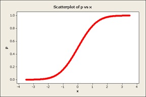
My graph only goes up
 You forgot to tell Minitab to use the Probability Density
when you did the Calc / Probability Distribution command.
The default is a cumulative probability, which is the area to the left of
the x-value. As you move to the right, the area to the left gets bigger and
bigger and you get a curve that looks like the one shown.
My graph isn't smooth
 You have a continuous distribution and you need to specify
a small step size when you do the Calc / Make Patterned Data.
I recommend 0.05 or maybe smaller (0.02) depending on how the graph
looks.
Another thing to notice here are the points that show up. For a
continuous curve, you should disable those when you are first creating the
graph by clicking on Data View and unchecking Symbols.
However, if you forget and create the graph with the points on it, you
can right click on the graph, choose Add / Data Display and then uncheck the
Symbols.
![]() At this point, we are ready to start adding
things to the graph, rather than just changing what is there. There is a
graph annotation toolbar that is active while you're editing a graph. If the
toolbar does not appear on your screen, then go to Tools / Toolbars / Graph
Annotation Tools and turn it on. Until this point, we have been using the
Select Mode (the arrow), but now we're going into insert Text (the T) or a
Lines (the line). Click on the appropriate mode to insert the right object.
Here are generic instructions for each type of object.
At this point, we are ready to start adding
things to the graph, rather than just changing what is there. There is a
graph annotation toolbar that is active while you're editing a graph. If the
toolbar does not appear on your screen, then go to Tools / Toolbars / Graph
Annotation Tools and turn it on. Until this point, we have been using the
Select Mode (the arrow), but now we're going into insert Text (the T) or a
Lines (the line). Click on the appropriate mode to insert the right object.
Here are generic instructions for each type of object. You forgot to tell Minitab to use the Probability Density
when you did the Calc / Probability Distribution command.
 You have a continuous distribution and you need to specify
a small step size when you do the Calc / Make Patterned Data.